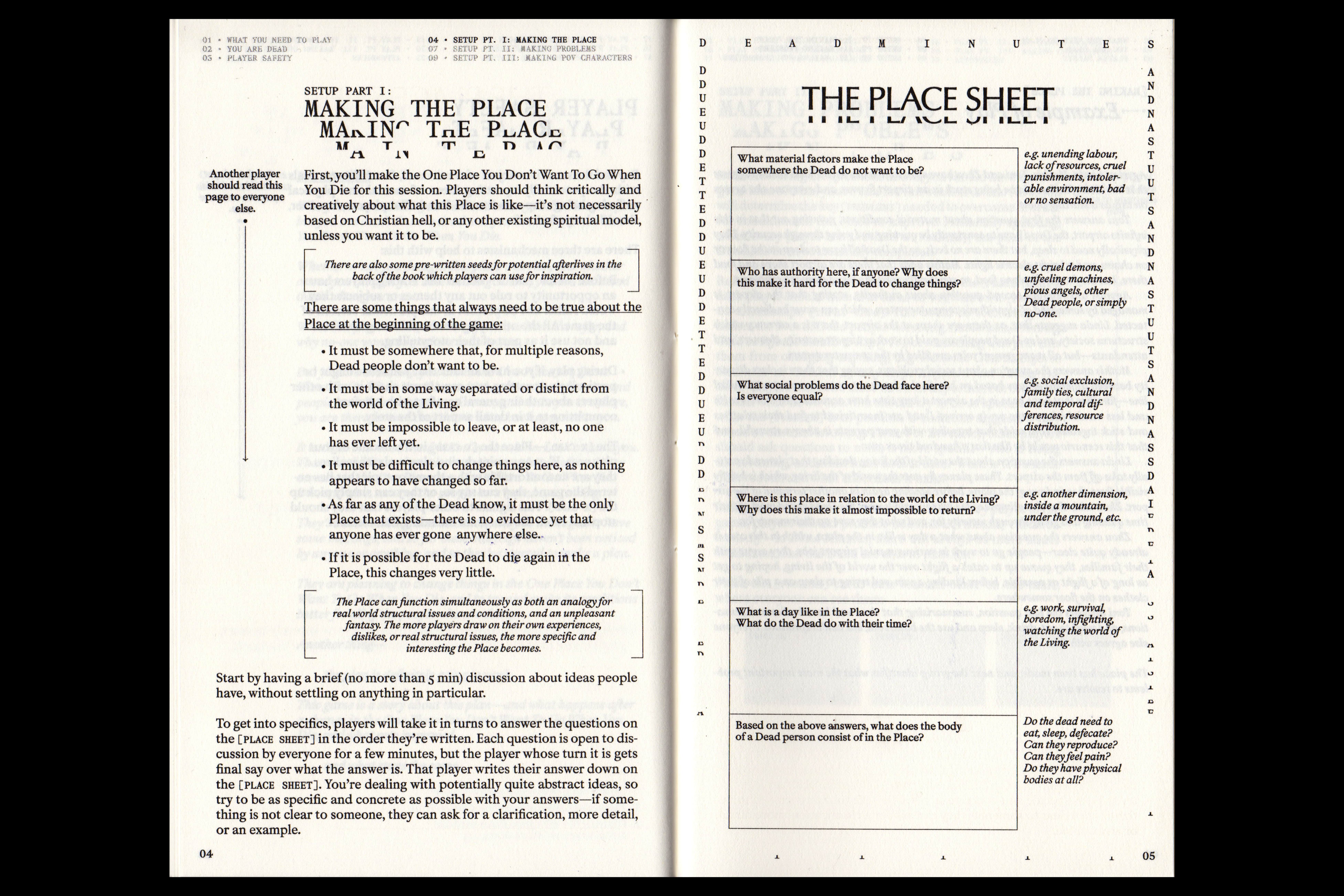
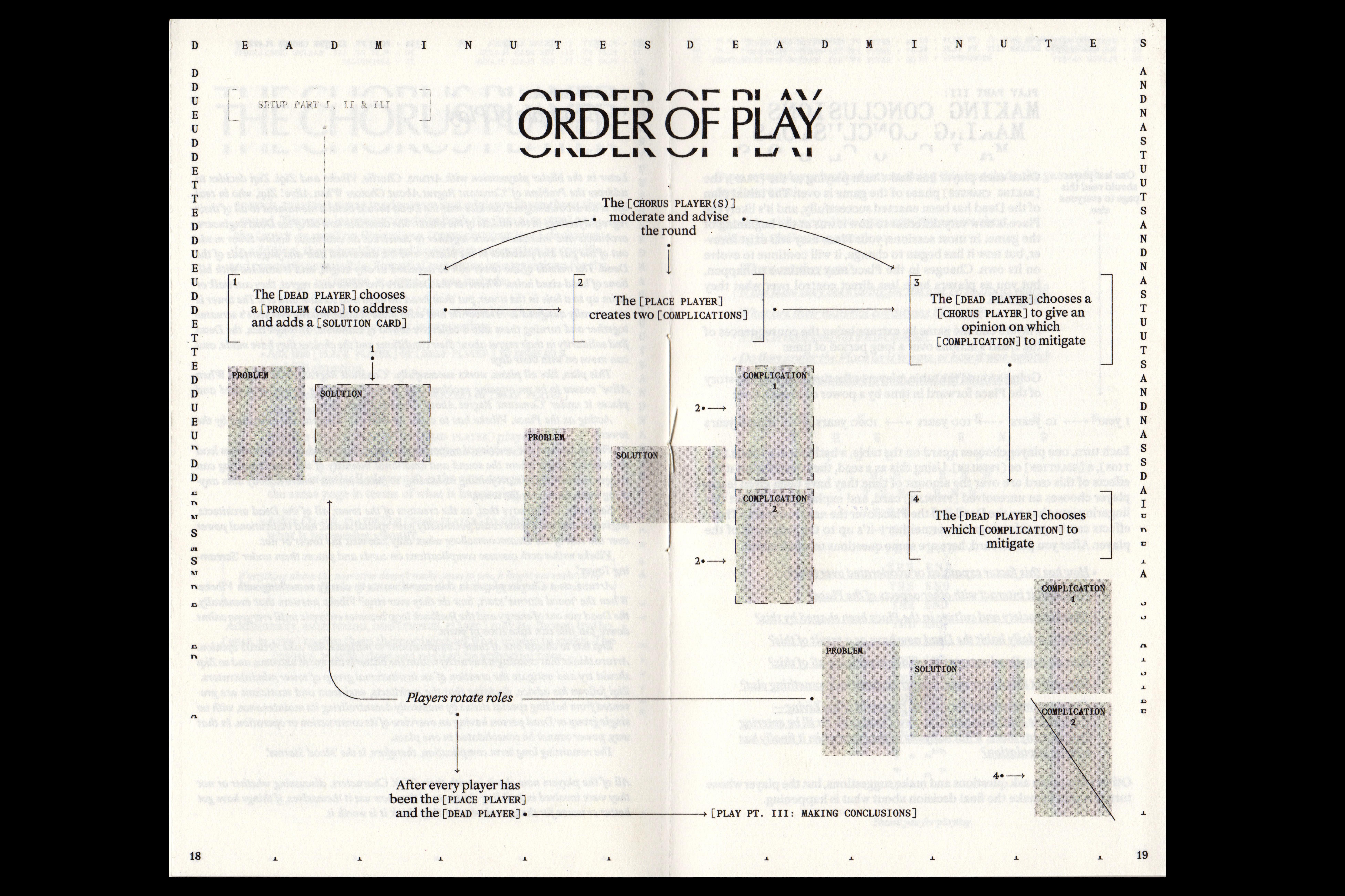
Dead Minutes
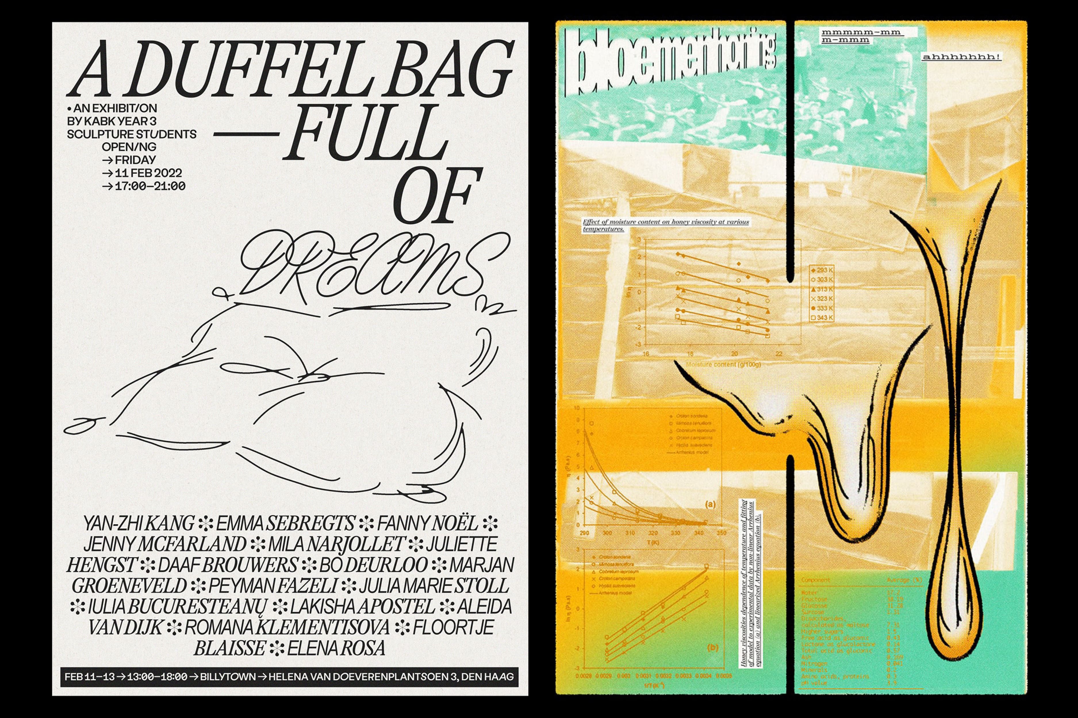
[2024] A Story Game About Space, Time, Organisation and The Afterlife By Tom K. Kemp Commissioned by STRP Eindhoven Editorial Design: Samuel Salminen Printing & Binding: no kiss? 36 pages 1-colour RISO print Paper: EOS 100g/m2 + EOS 120g/m2 Edition of 200 Typefaces: Mercure by Charles Mazé / Abyme Optima by Hermann Zapf
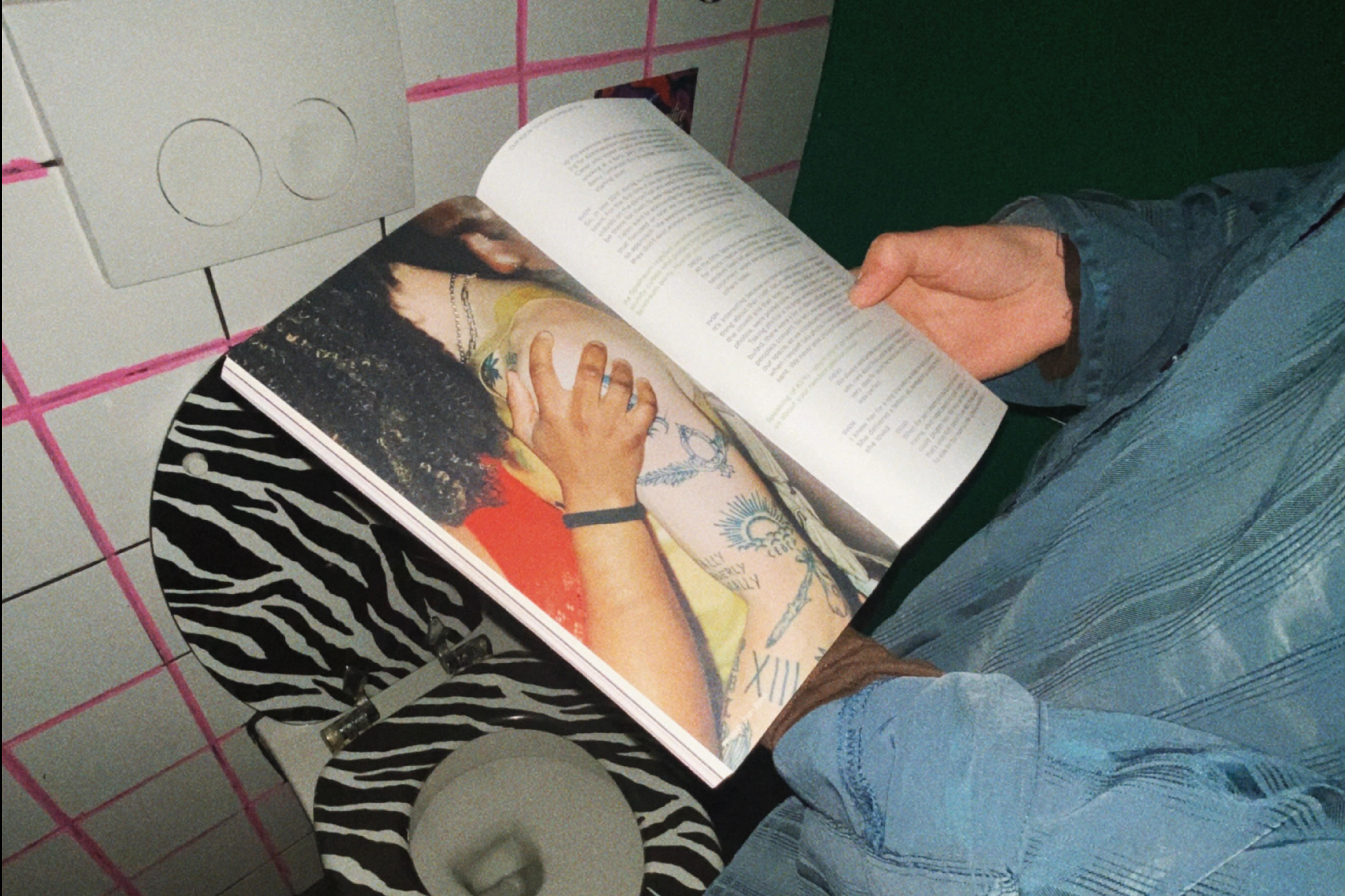
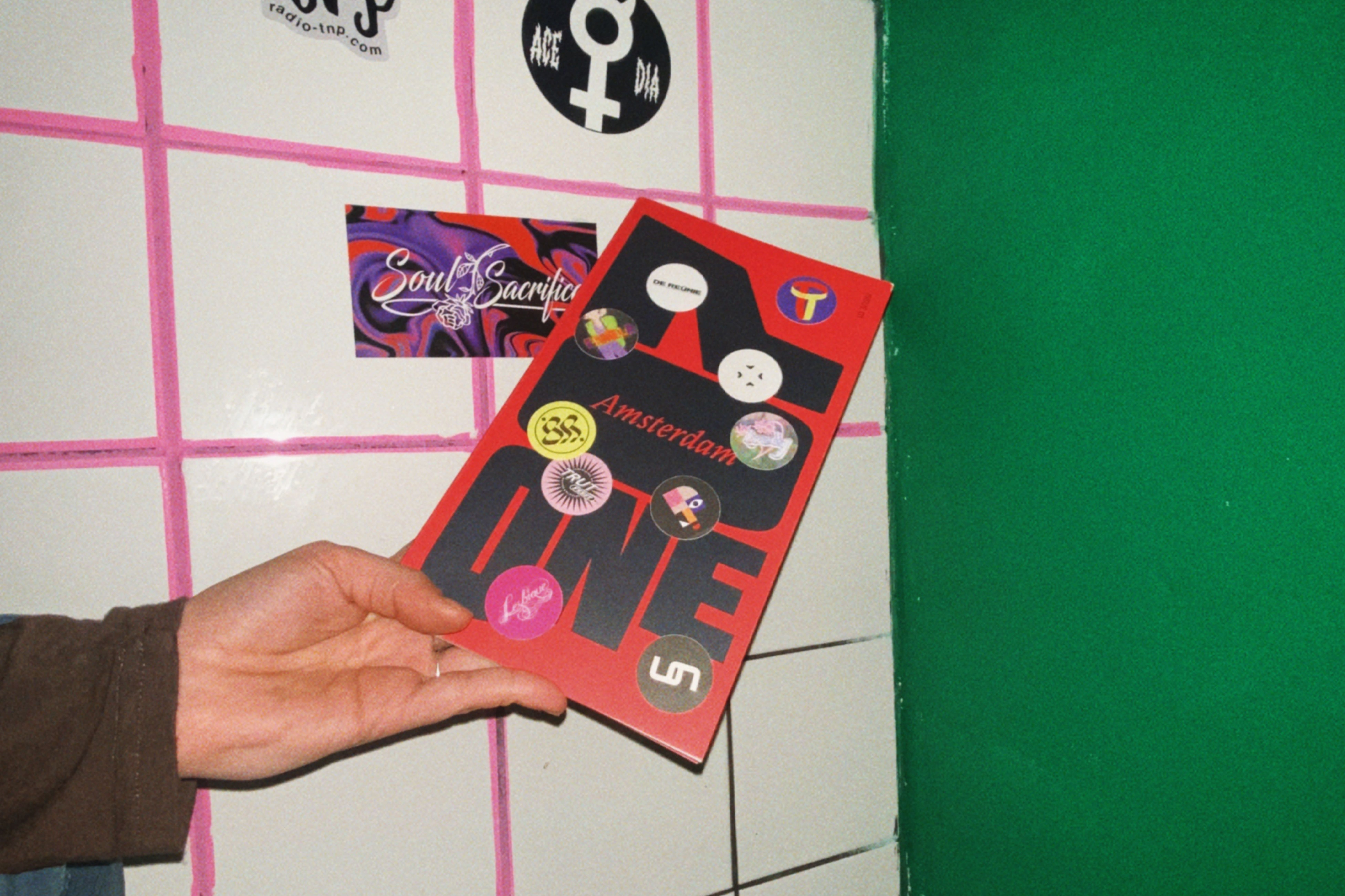
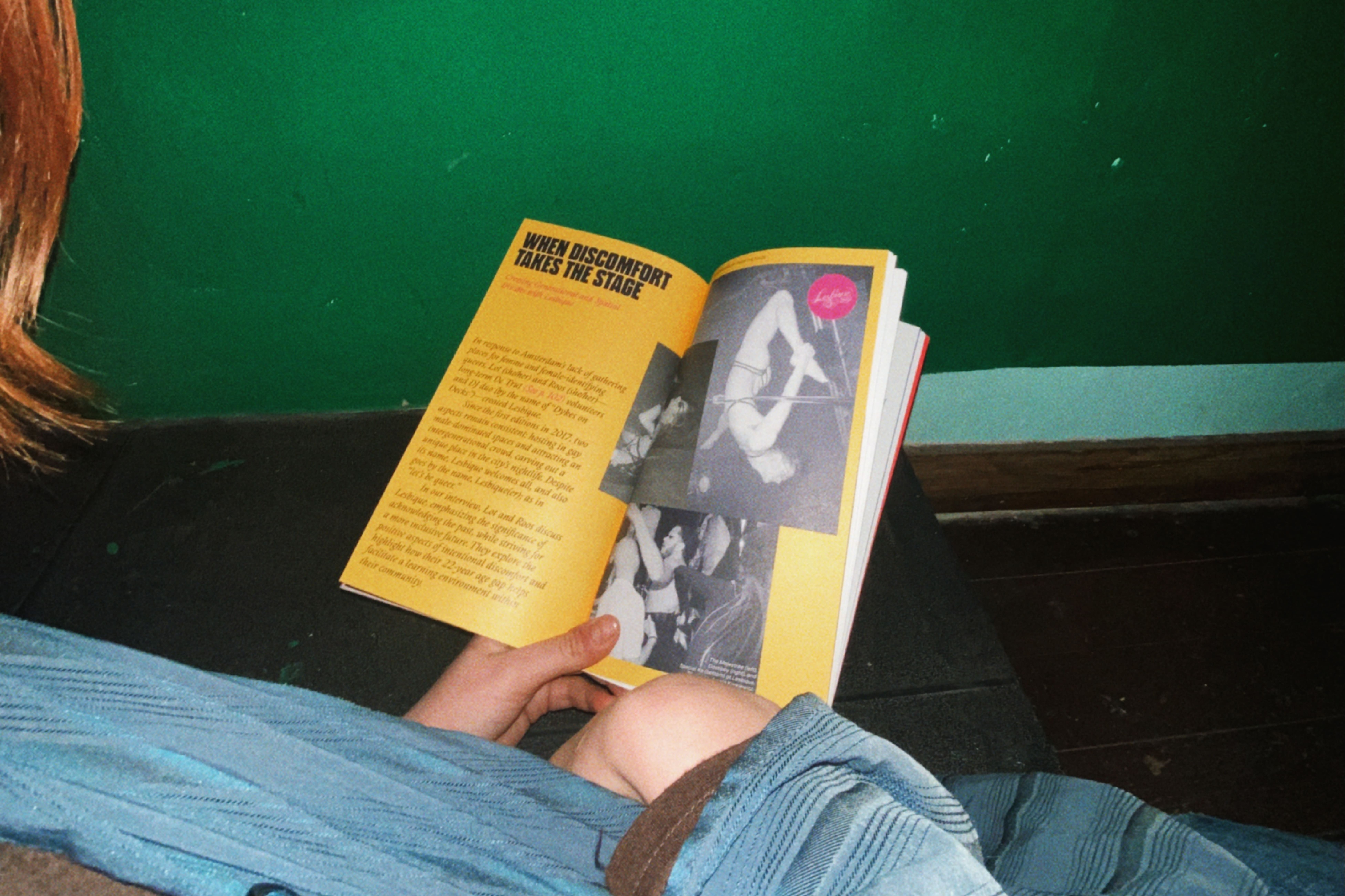
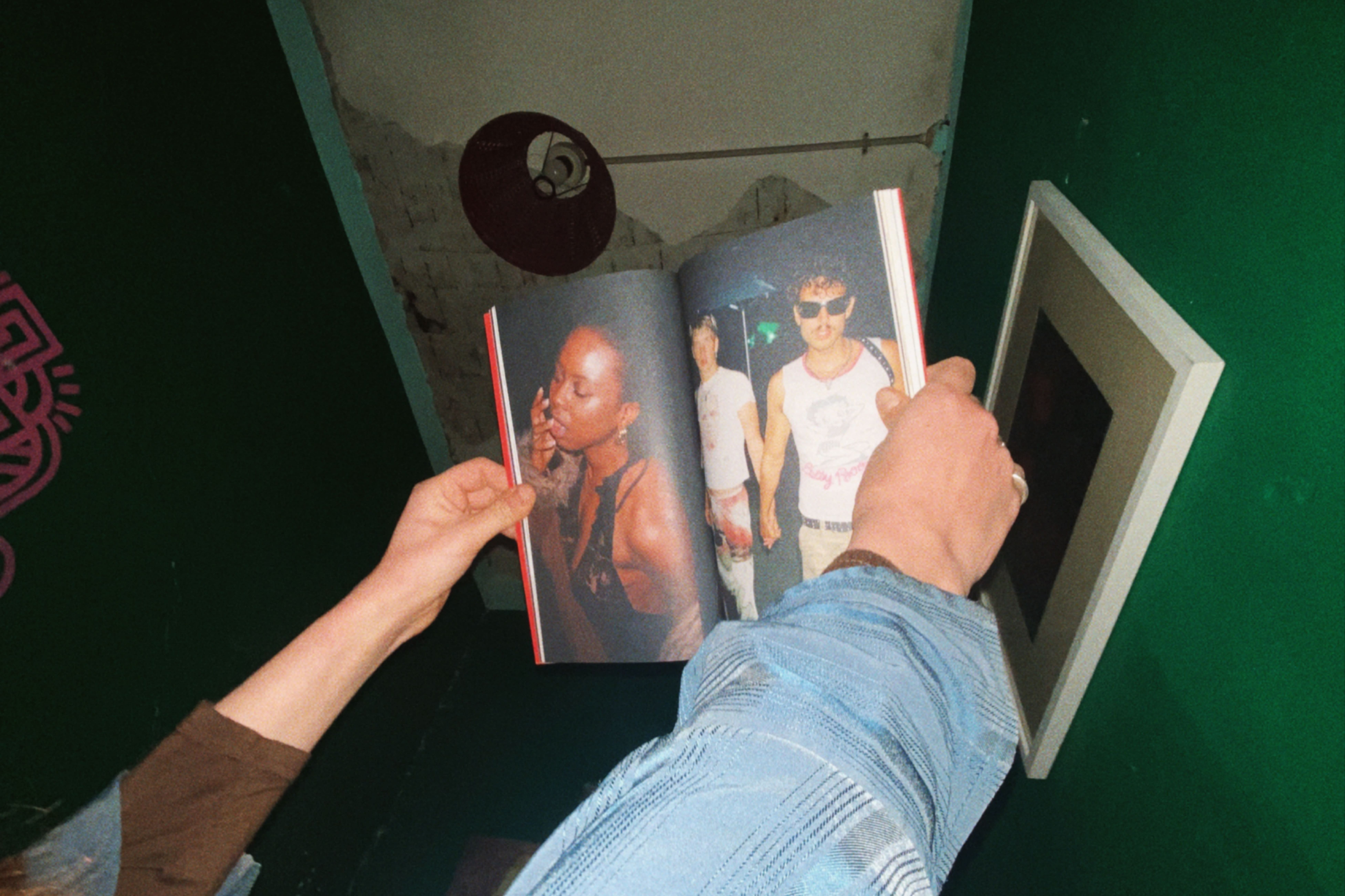
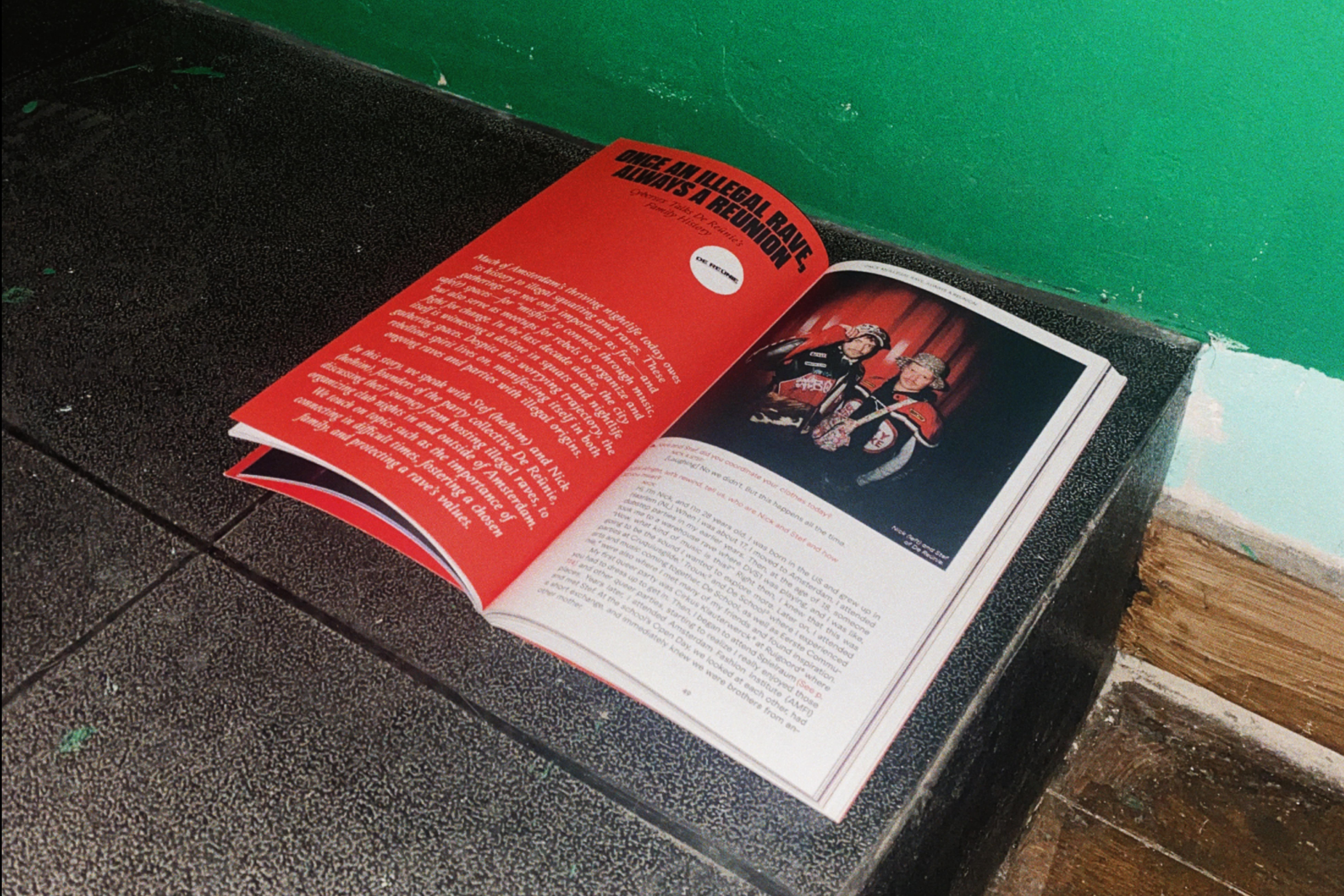
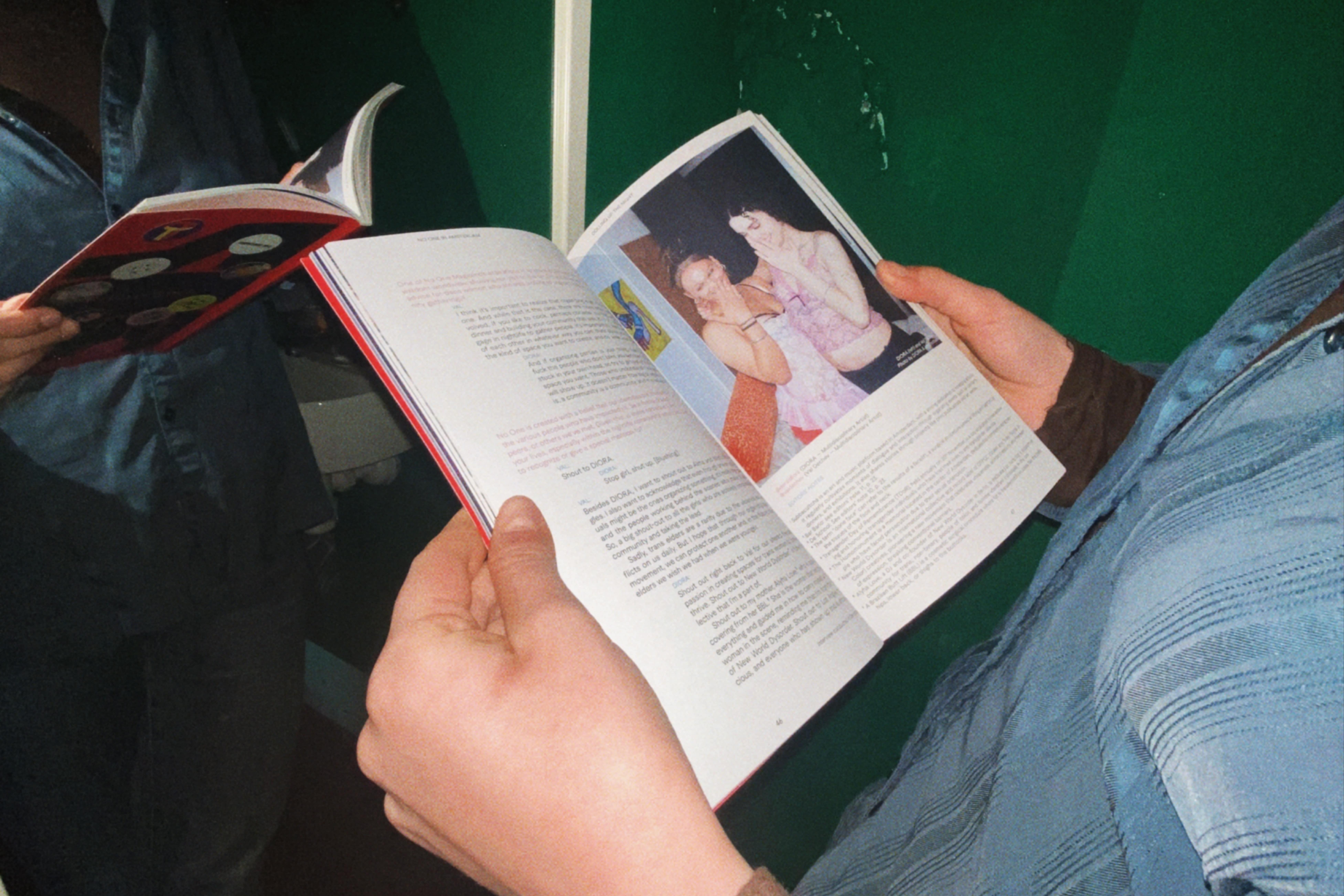
NO ONE Magazine — Issue 01: Amsterdam
[2024] Print publication about underground queer nightlife around the world Writers & Editors-in-Chief Viet & Jeremy Raider-Hoang Content & Creative Direction Viet & Jeremy Raider-Hoang Editorial Design Samuel Salminen Printing & Binding Printing House KOPA 128 pages Edition of 1000 Typefaces: Macan by Tightype Adelphe by Eugénie Bidaut Queering by Adam Naccarato
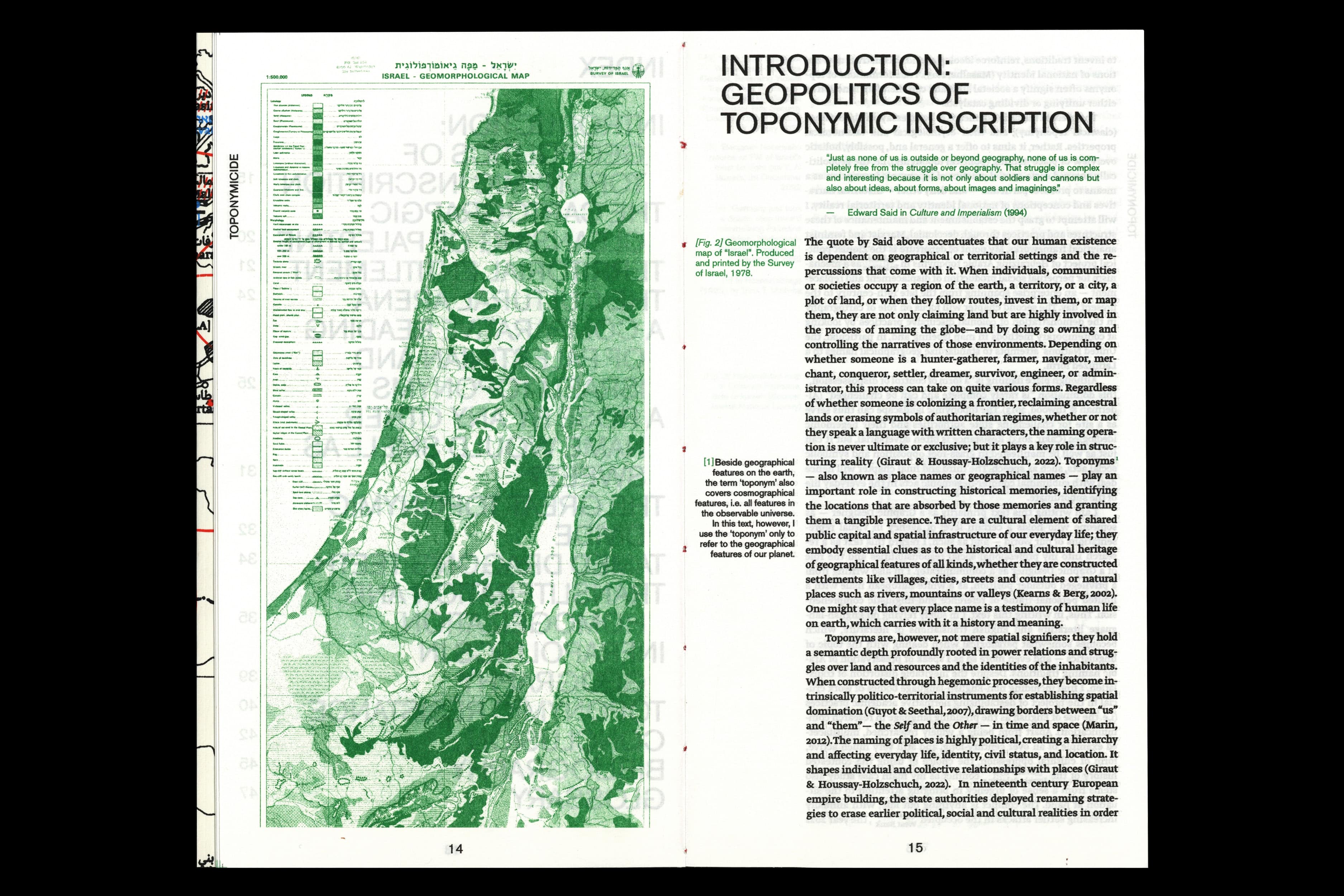
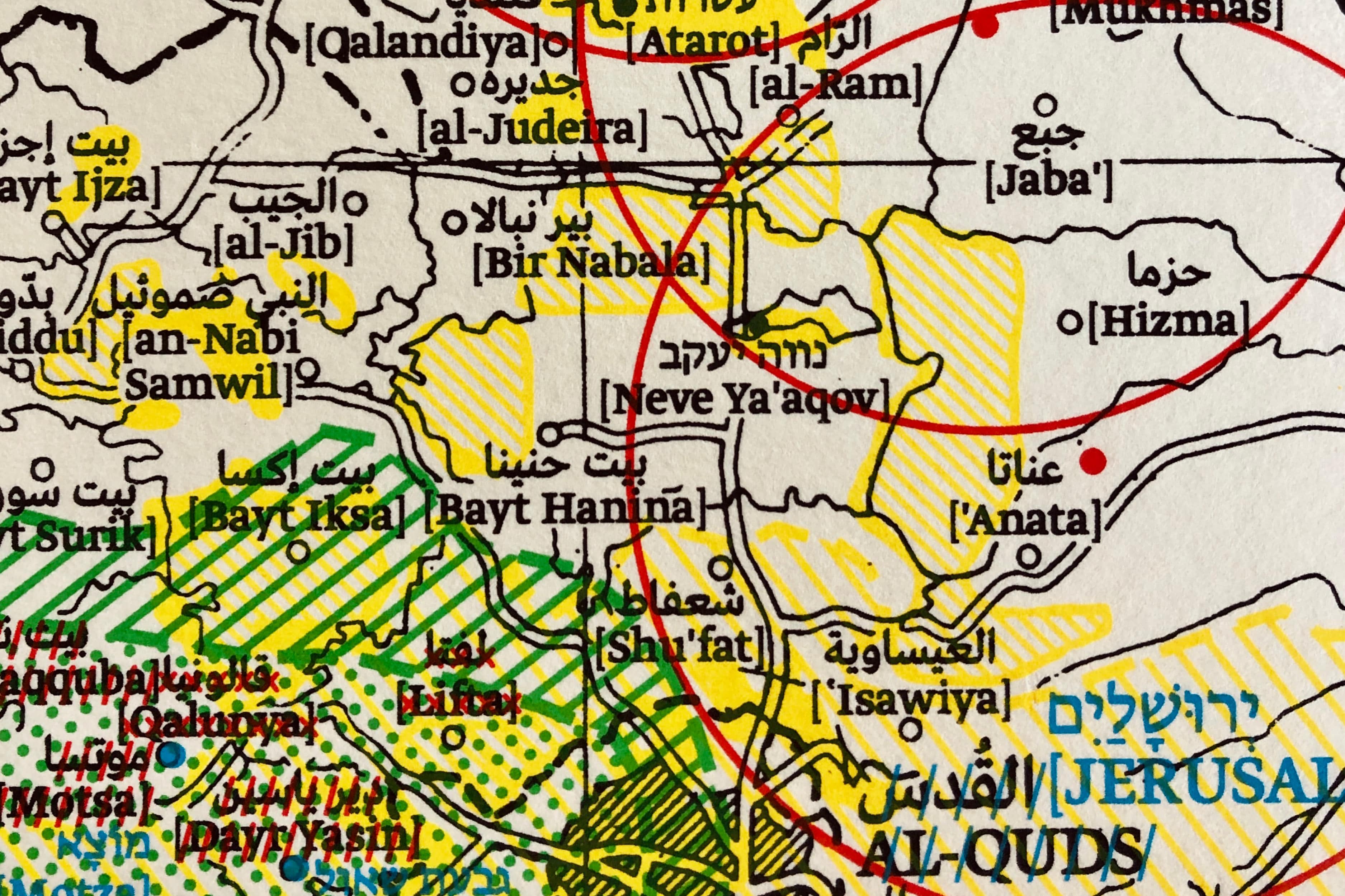
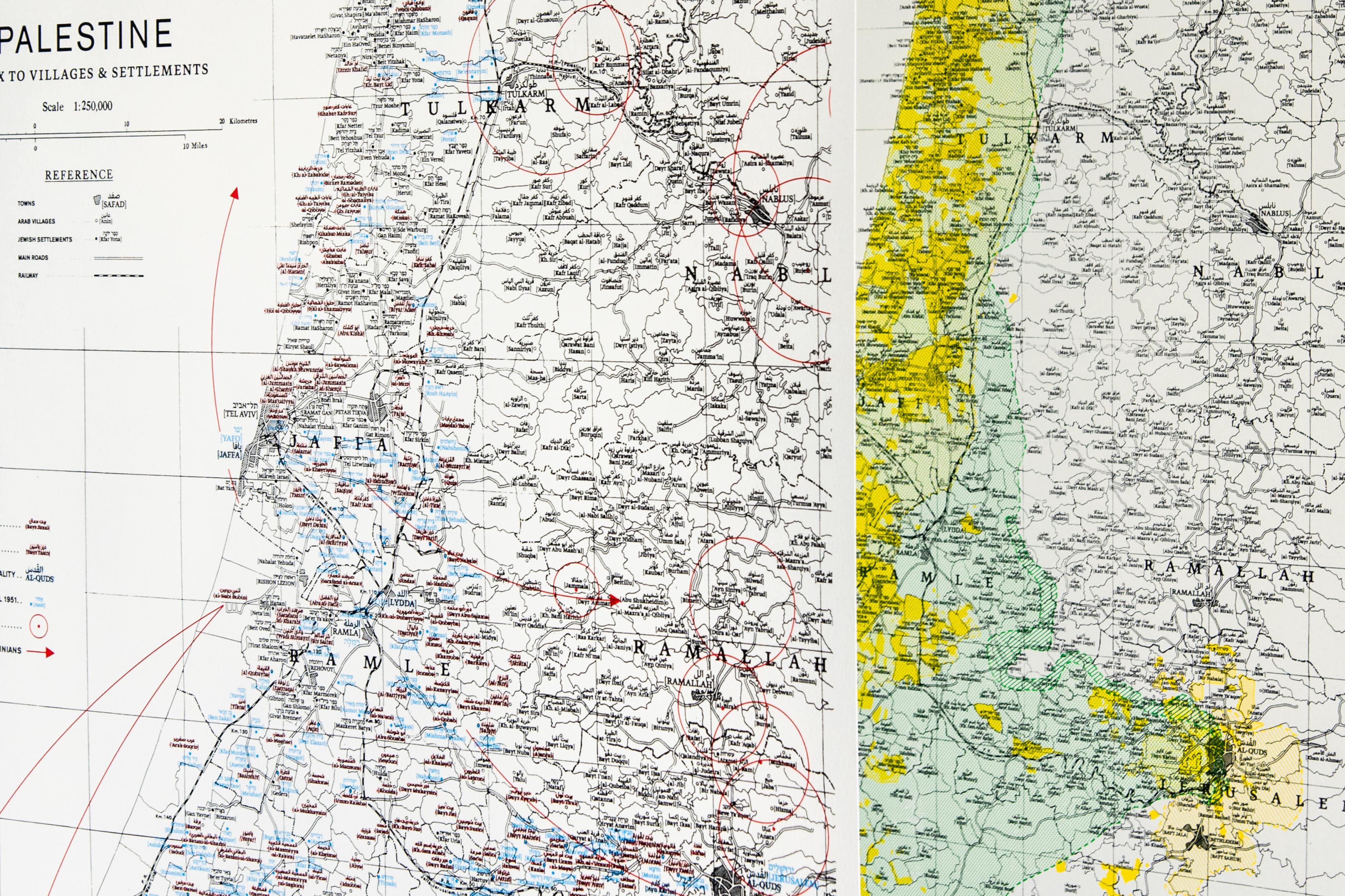
TOPONYMICIDE
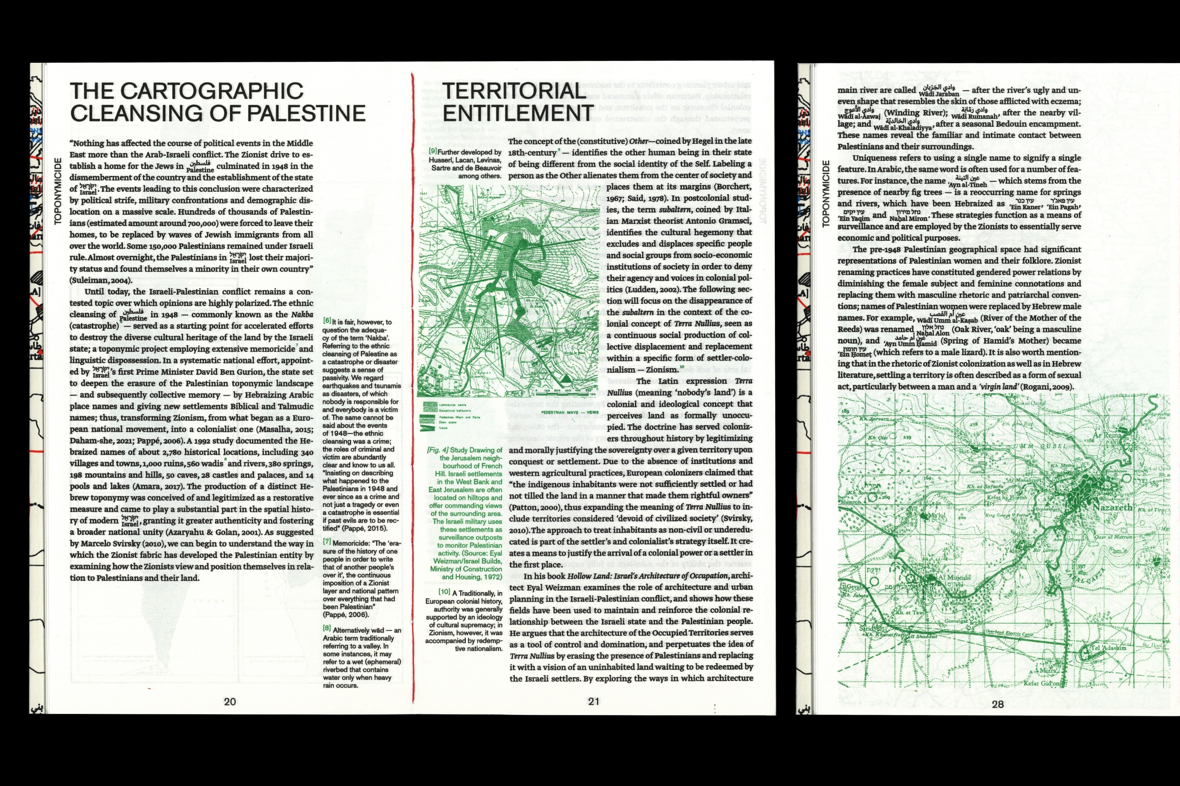
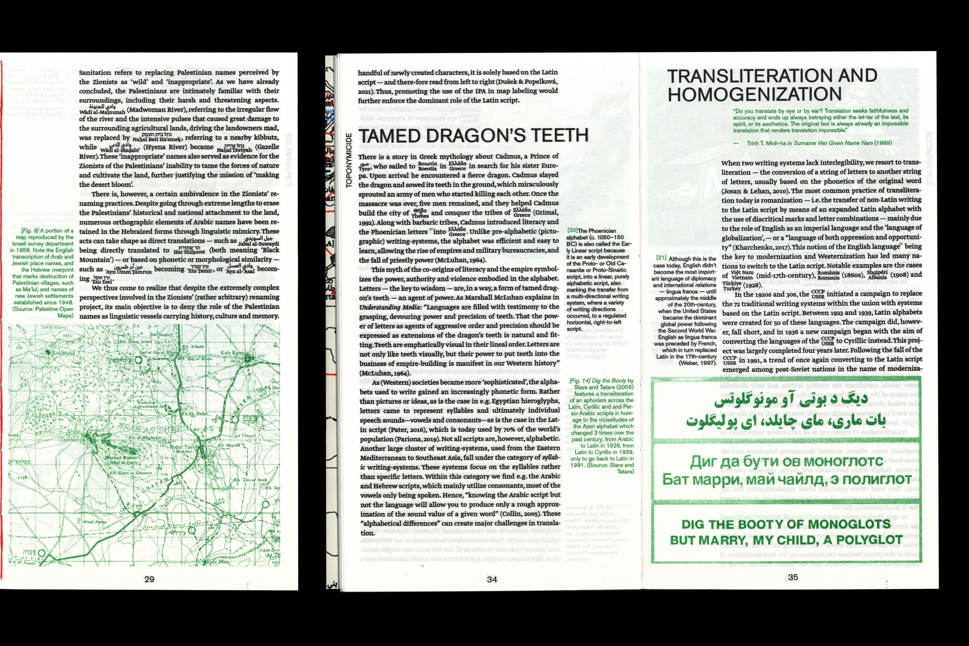
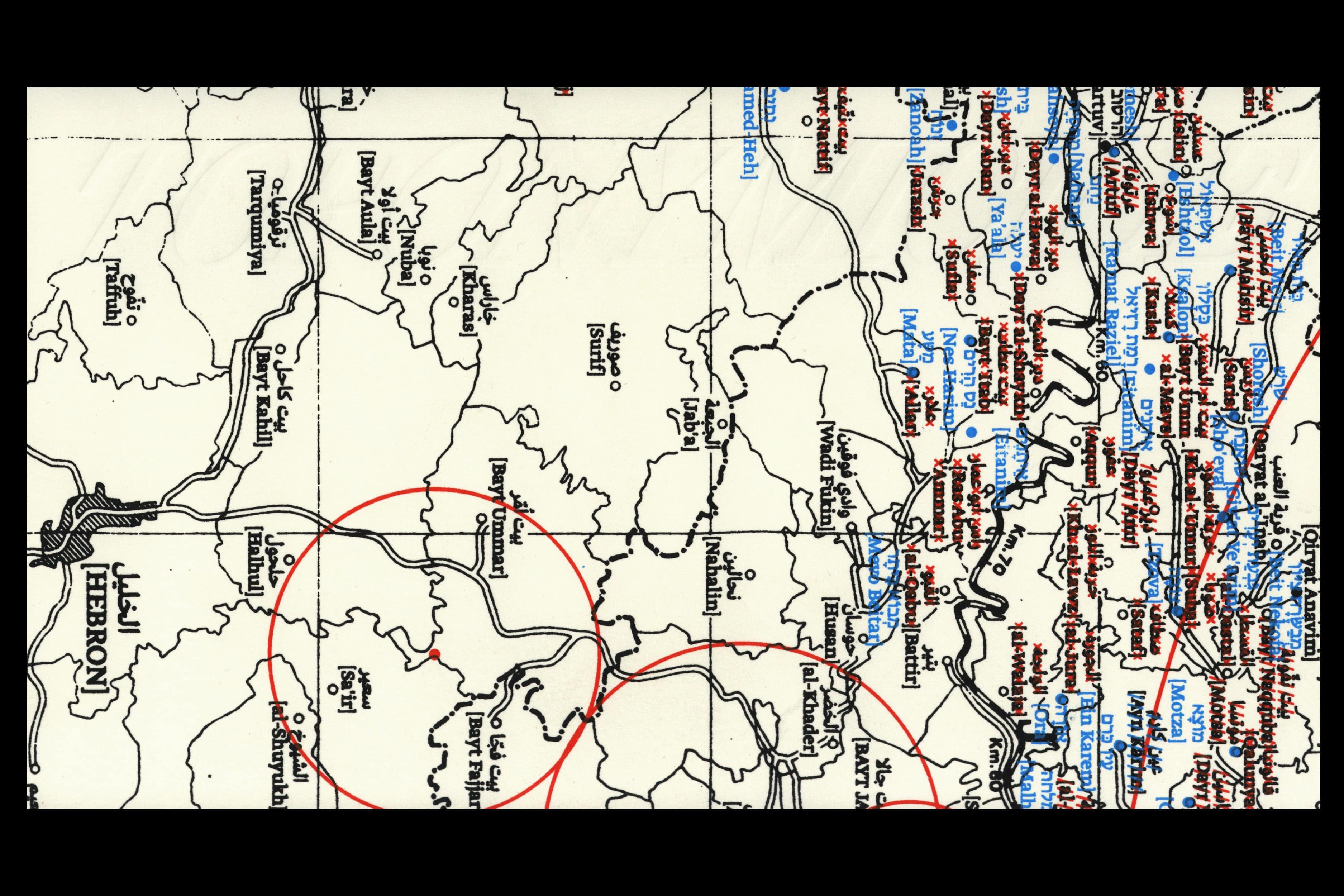
[2023] Bachelor's Thesis — Graphic Design Royal Academy of Art The Hague The names of geographical locations, also known as toponyms, play a crucial role in shaping the identities of individuals and communities and constructing historical memories. The process of naming is not only about claiming land, but also about owning and controlling narratives of the environment. The naming of places holds political significance and is often used as a means to establish spatial domination, drawing borders between groups and shaping the relationship between individuals and their surroundings. Place naming can thus serve as a tool for constructing new notions of national identity and promoting certain historical narratives while denying, surpressing or erasing others. Through decolonial analysis, this study will attempt to provide an overview of the geopolitically charged practice of toponymic inscription, with the main point of departure being the Zionist political project of Hebraizing Arabic toponyms in Palestine. The focus will then shift to the role and power of cartography and the Latin script in colonial discursive practices, and finally to a closer look at subliminal counterhegemonic acts of resistance in the everyday lives of the subordinate. Supervised by Prof. Füsun Türetken → READ ONLINE 48 pages 2-colour RISO print Cover: 3-colour screen print Paper: EOS 90g/m2 Edition of 32 Typefaces: Greta Text by Typotheque Akzidenz Grotesk by Berthold Types
Non-Papers of Constructed Absence
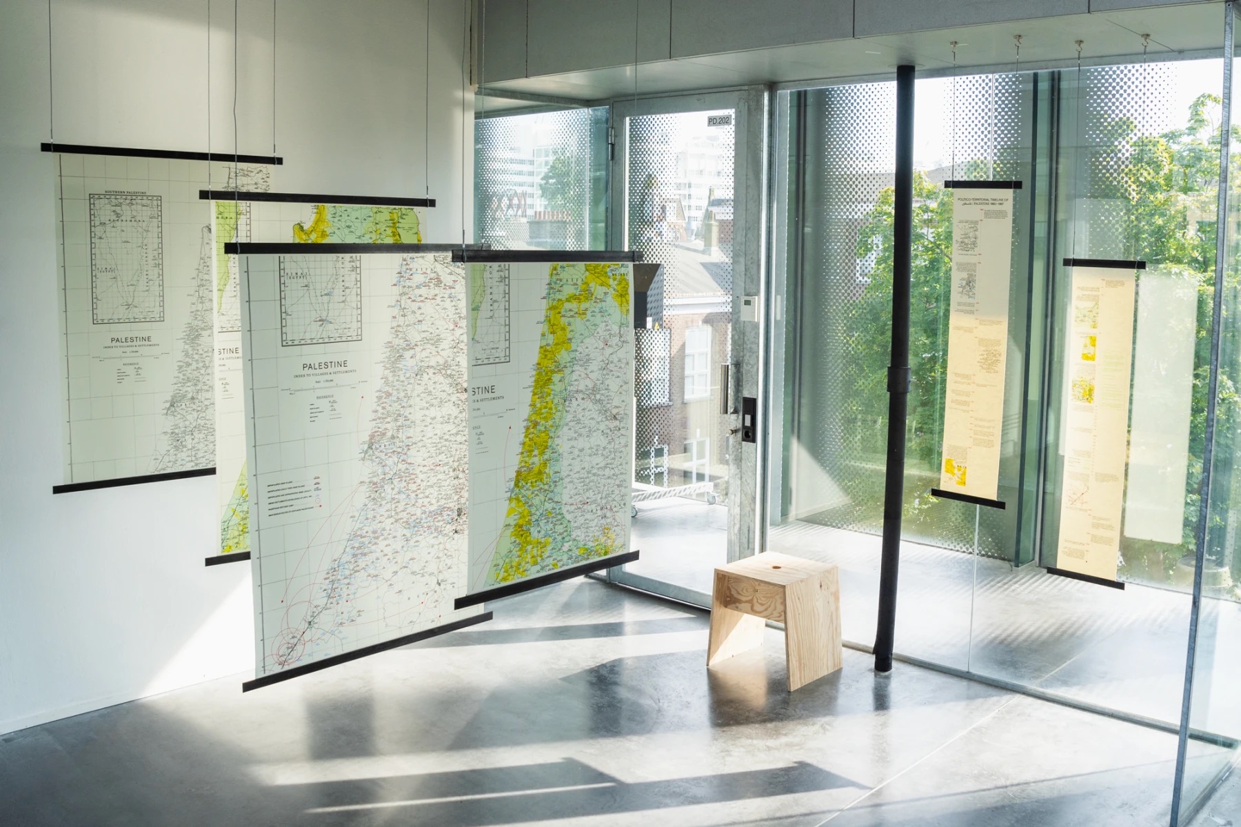
[2023] Graduation Project — Graphic Design Royal Academy of Art, The Hague Cartography is intrinsically a form of political discourse — whether intentional or unintentional, maps produce and, above all, suppress knowledge and perpetuate systems of power and oppression. Non-papers of Constructed Absence investigates the ways in which maps and other forms of spatial representation — reinforced by the languages and writing-systems they employ to create meaning — are used as instruments for shaping socio-political narratives while erasing indigenous voices, spaces, and histories. Drawing upon comparative analysis of maps created between 1946 and 1951—before and after the Nakba and the establishment of the State of Israel — Samuel utilises layered spatial data, overprinting, and multi-script typesetting to intervene with ‘official’ documents and shed light on the silencing and desired non-existence of Palestinians that lies at the heart of Zionist cartographic narratives; investigating what has been erased, added, and class="lazy" altered in order to deconstruct the politico-territorial narratives the maps reproduce. By drawing attention to these power dynamics, the work challenges the idea that cartography can ever be truly objective, and strives to imagine new ways of representing space that are more rooted in plurality, historical transparency, and social justice. Tutors: Ruben Pater & Silvio Lorusso Transliteration consultant: Diya Ghantus Typeface: Greta Text by Typotheque → GRADUATION CATALOGUE
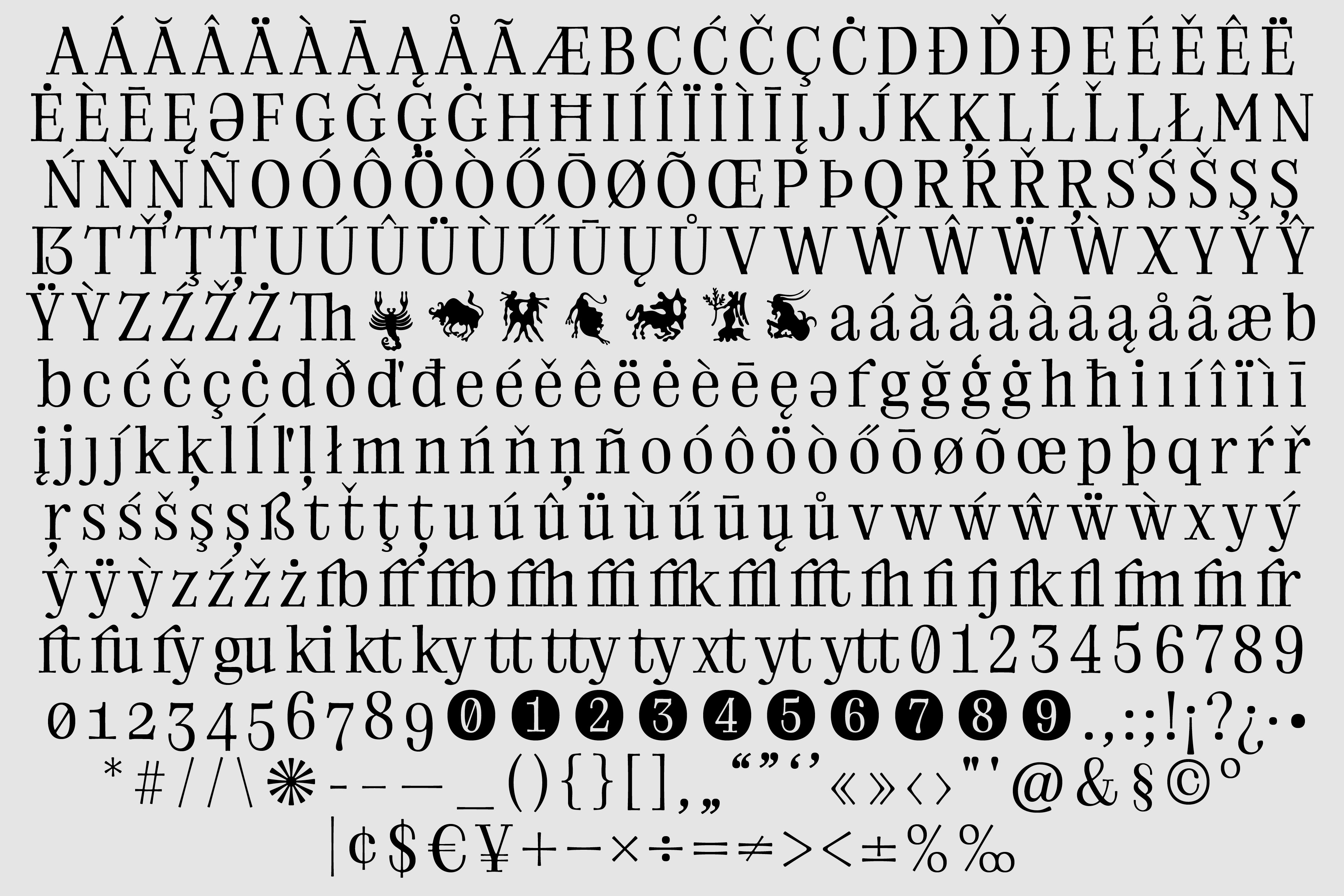
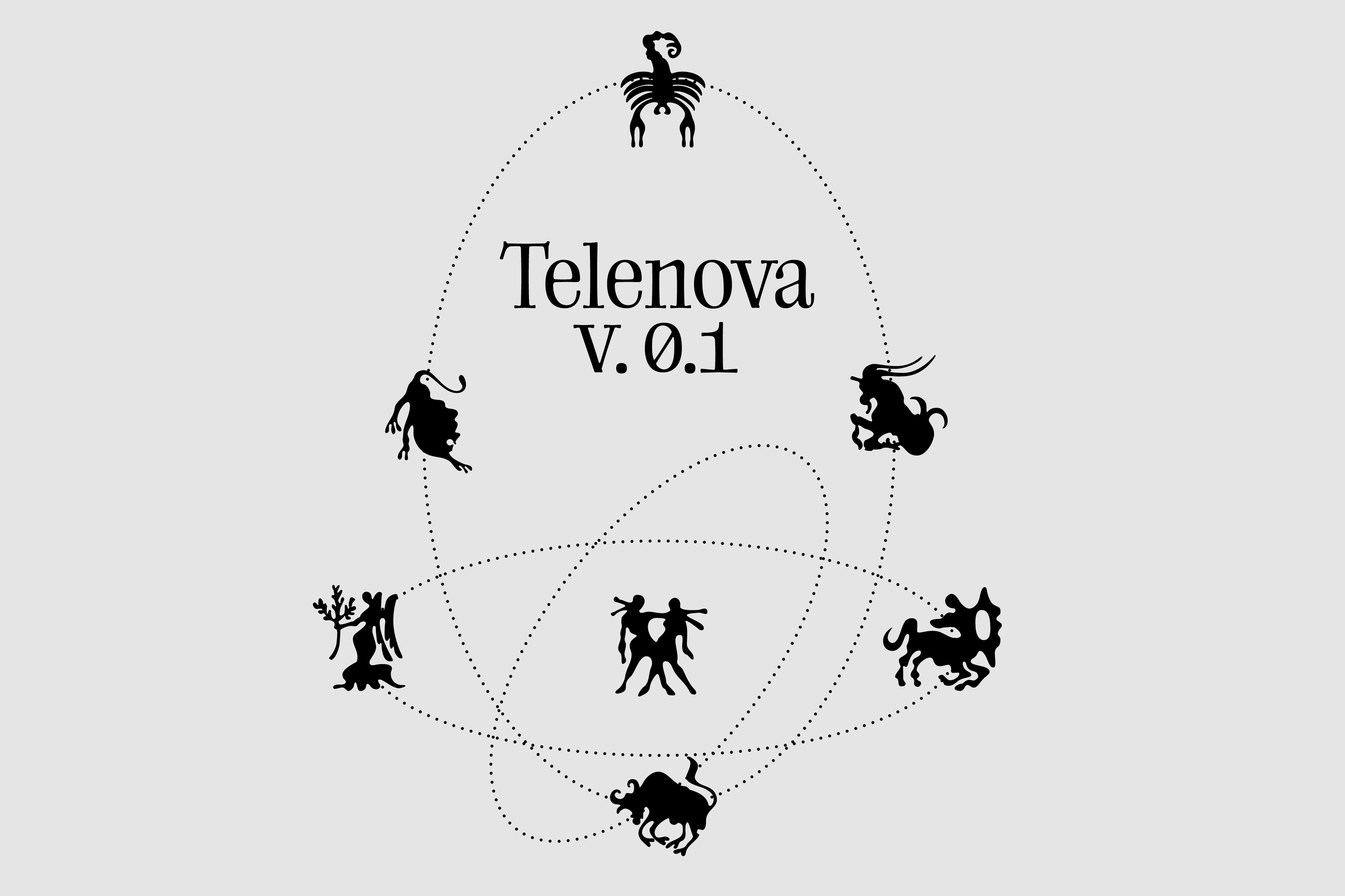
Telenova
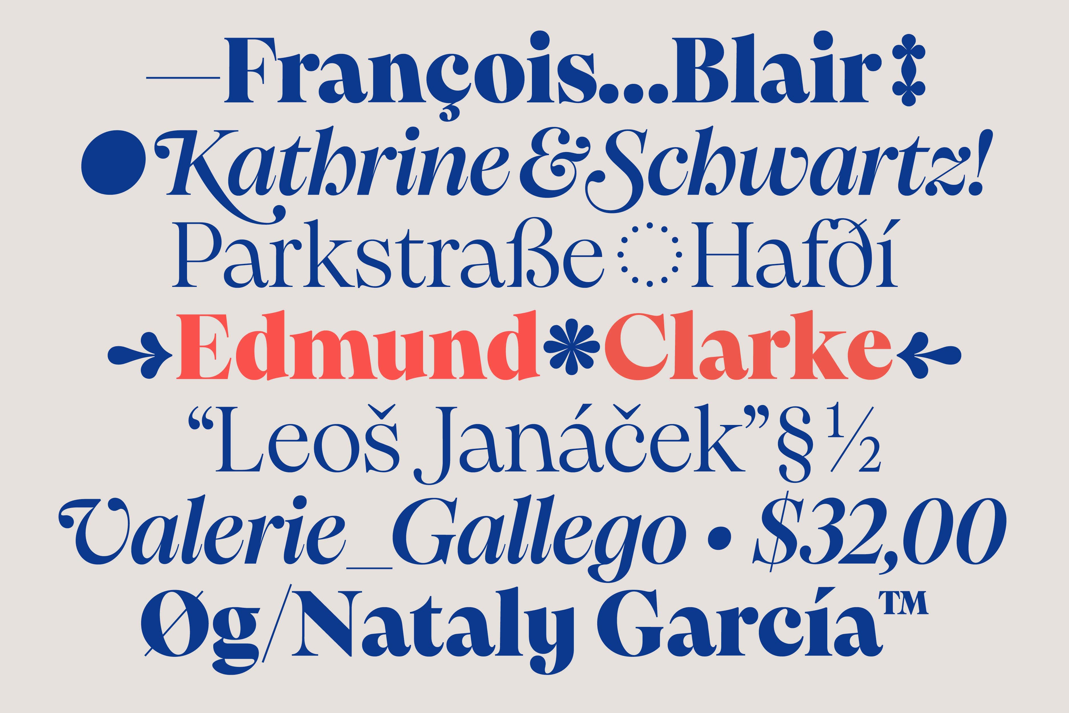
[2021] Designed in collaboration with Basia Strzeżek → Email for trial/licence.
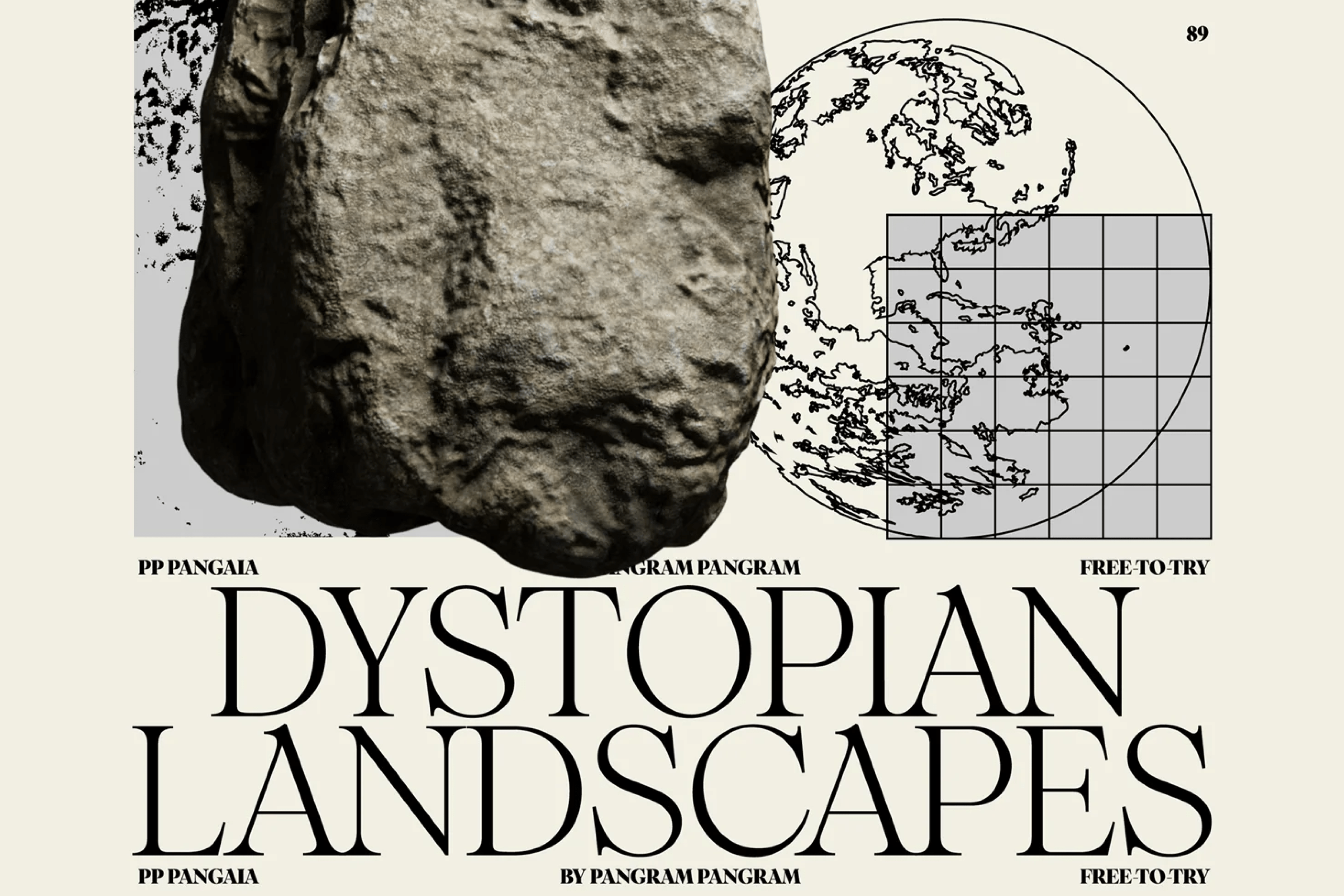
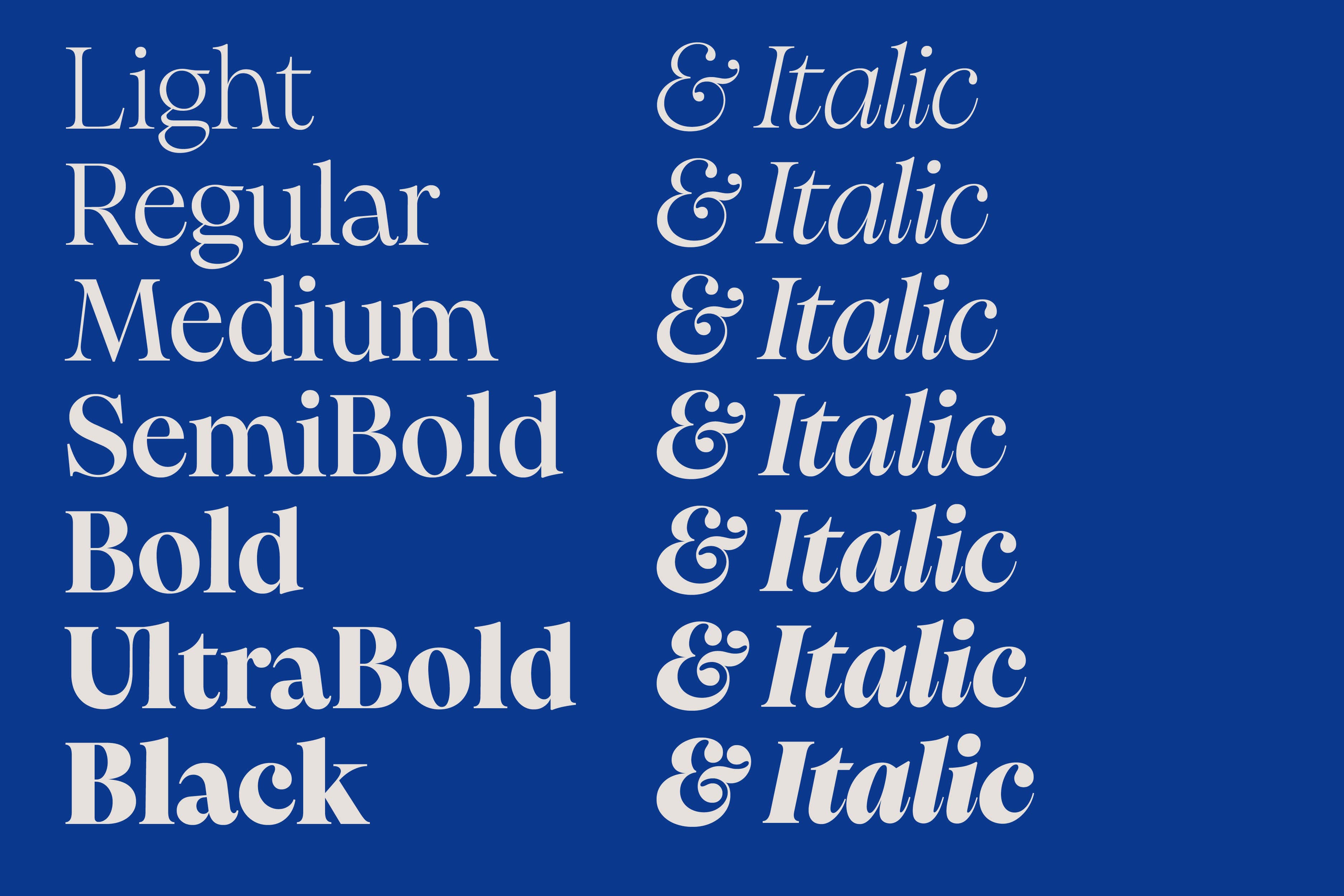
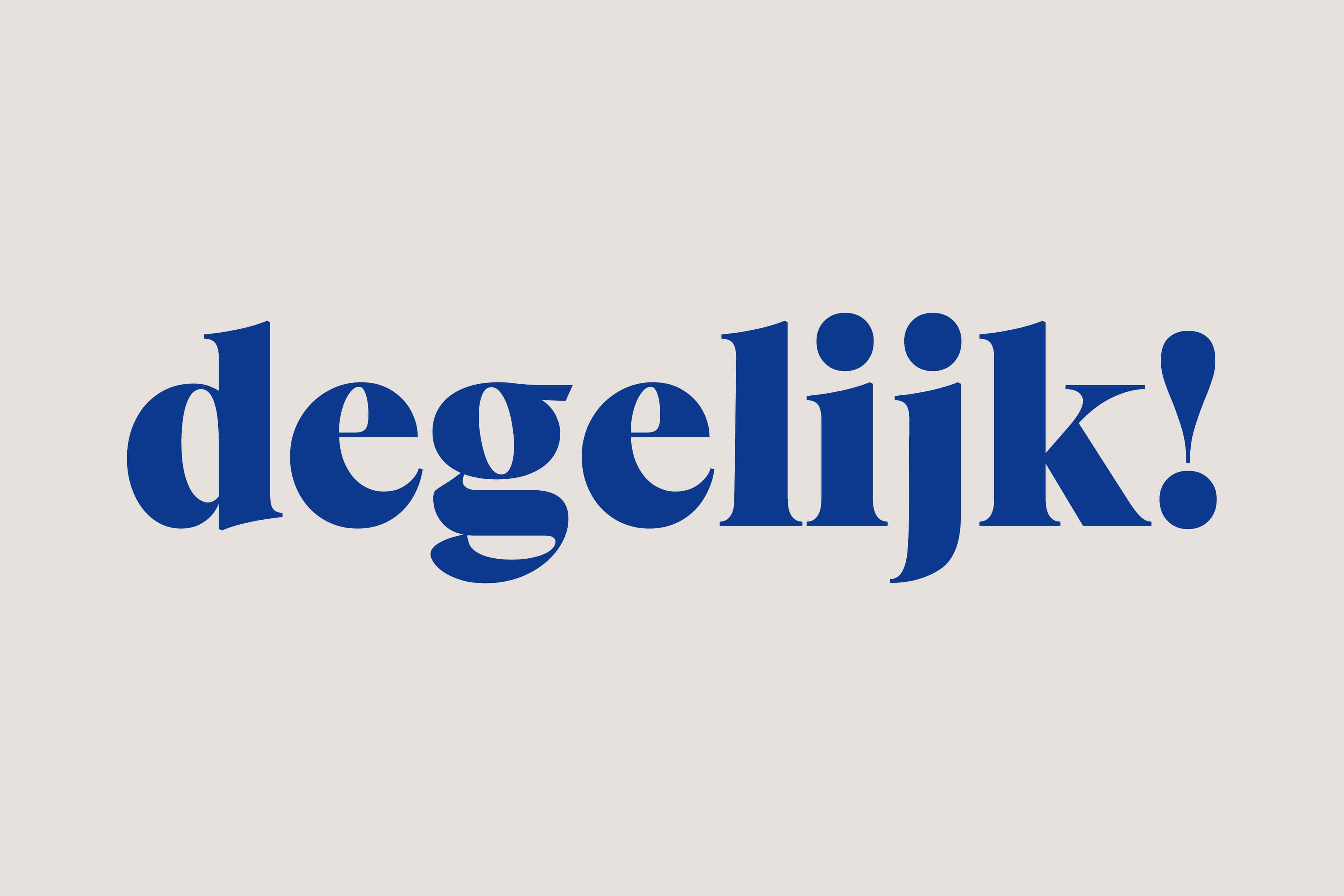
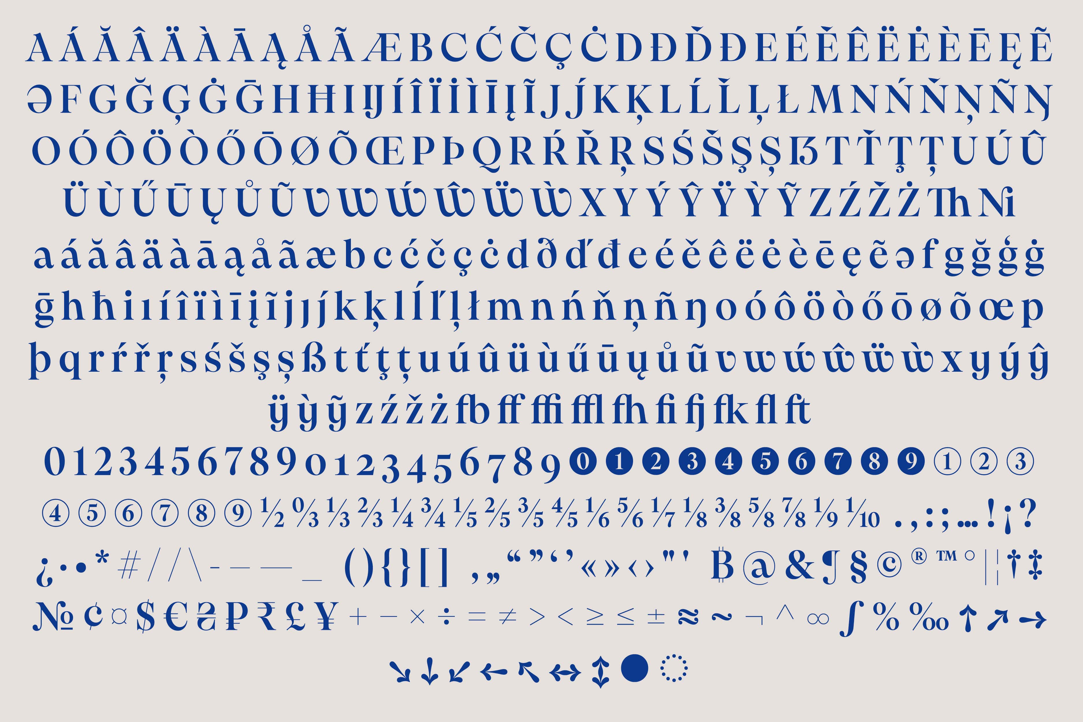
PP Pangaia
[2023] Try for free → PANGRAM PANGRAM A typeface seamlessly blending the splendour of traditional serif fonts with the rough, raw, organic beauty of Mother Nature. Drawing directly from the wonder of the Earth and its flora and fauna, Pangaia’s fluid curves inhabit the gentle contours of leaves, riverbanks, and mountain slopes – capturing the joyful, harmonious connection between type, texture and terra firma. Each character in Pangaia is meticulously crafted to evoke imagery of the ground on which we walk – planting itself like the roots of ancient woodland or the rough, rugged foundation of the Earth itself – with serifs blossoming like skyward branches. Its smooth, undulated lines emulate the unprescribed shapes of natural landscapes – the soft, rolling hills and the tranquillity of waters calm. As one, Pangaia inhabits and enlivens our unity with the Earth, both celebrating and making aware of the delicate balance shared between us and the wider world, from its plunging, striking swashes to its powerful italic cuts across 18 total styles. No matter the application, be it brand, book and anything in between, Pangaia is more than just a typeface. Pangaia is a proud, earnest embodiment of nature’s uncorrupted grandeur – offering a sense of connection and respect for our planet through each and every structural form. Designed in collaboration with Mat Desjardins & Francesca Bolognini
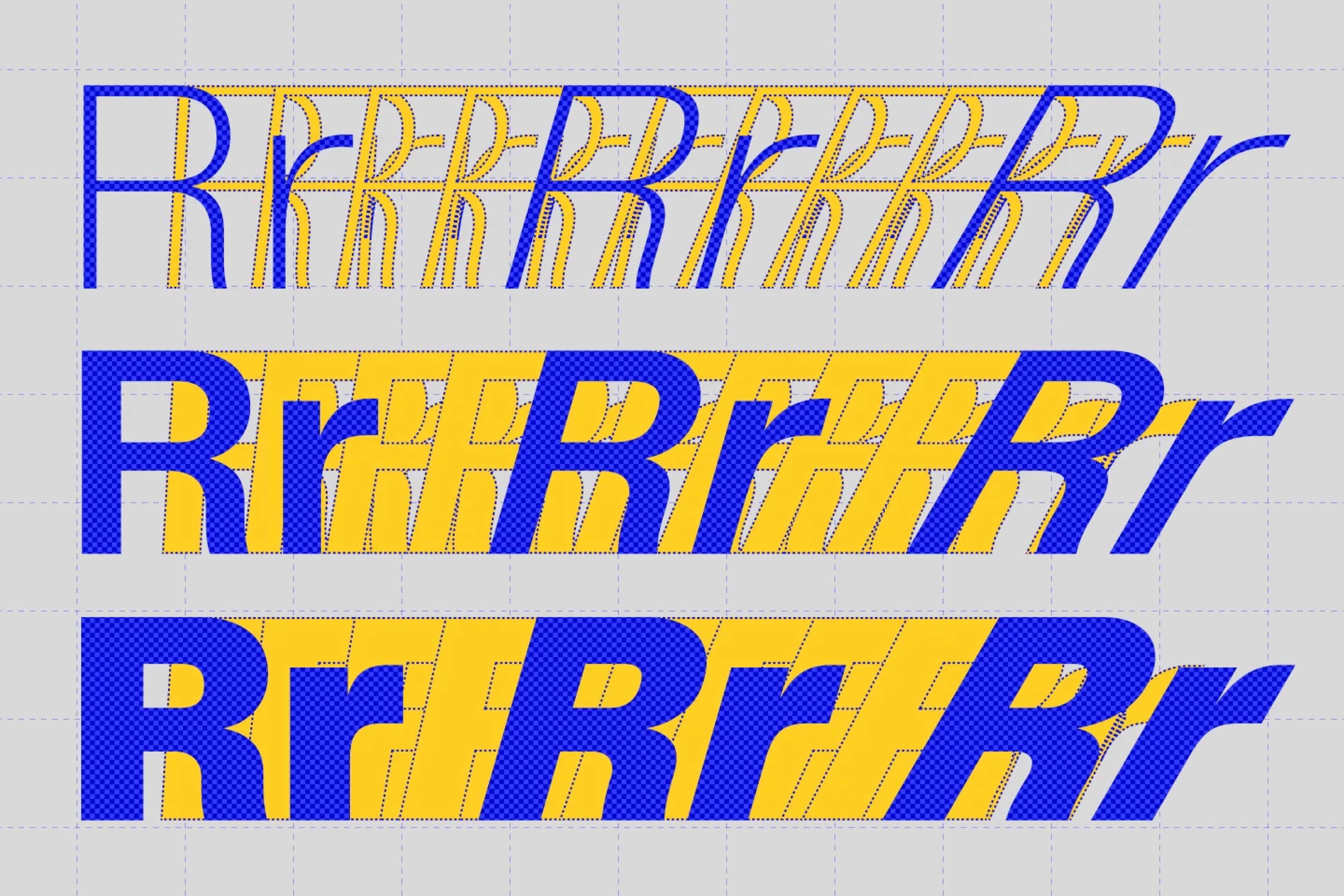
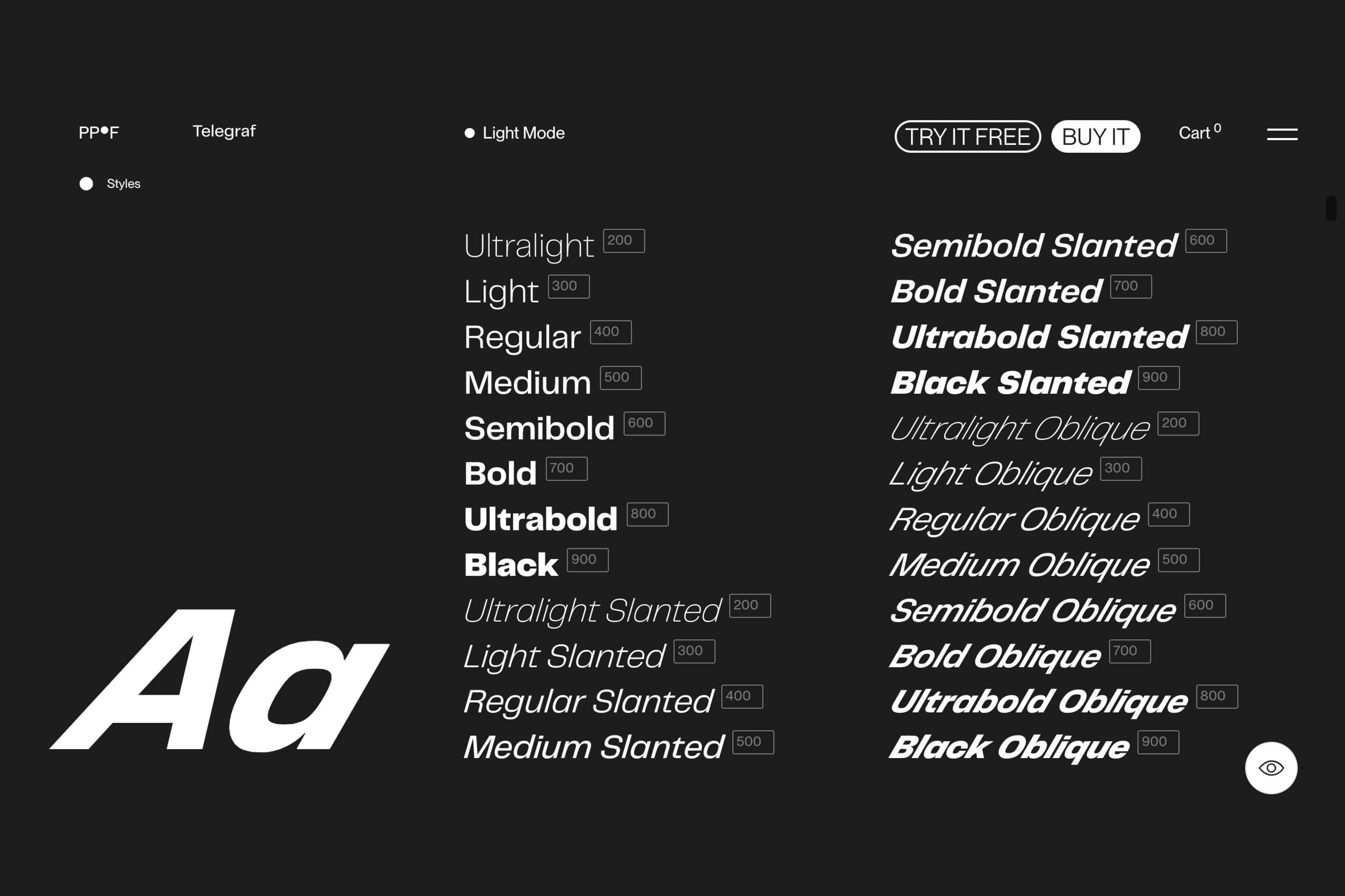
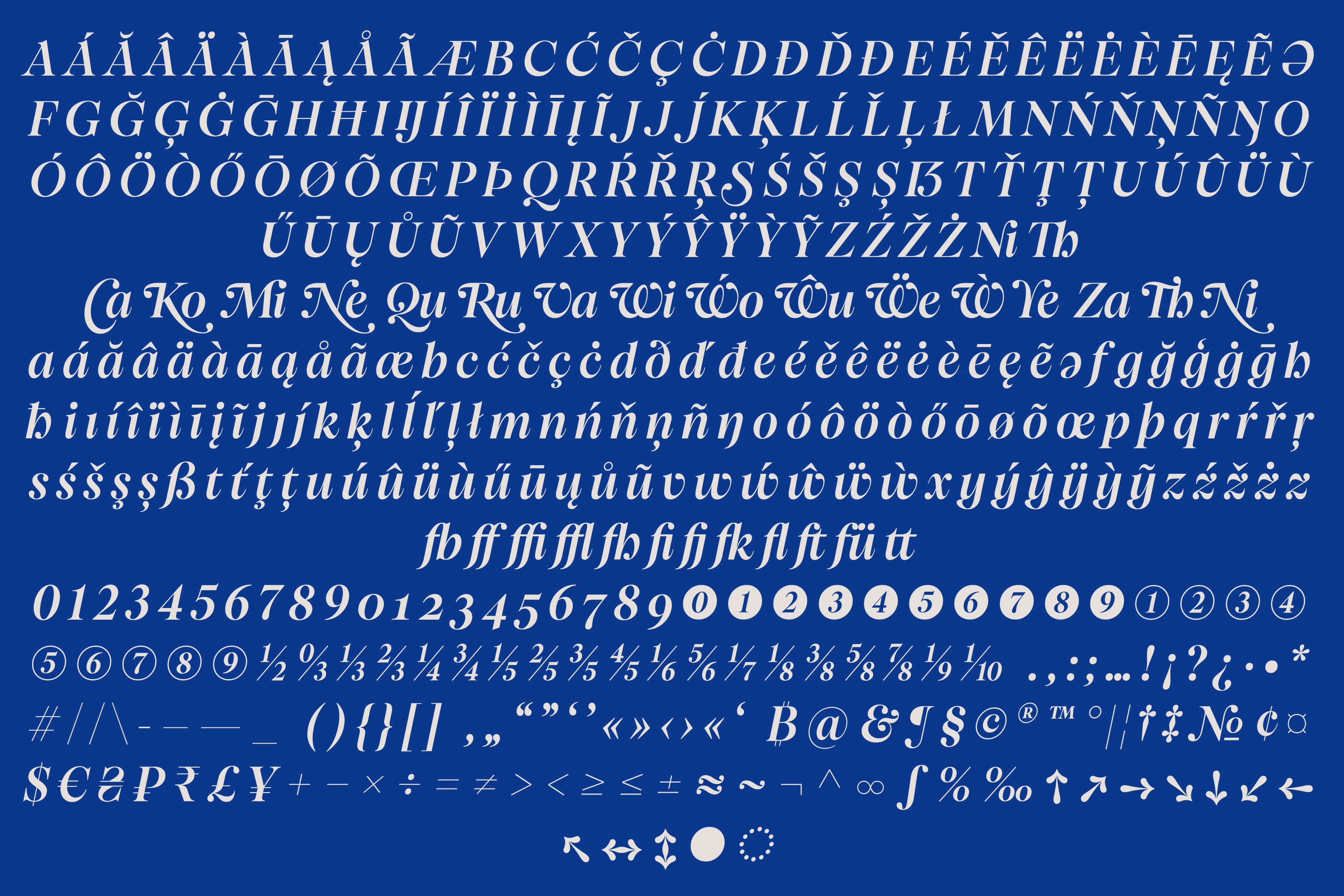
PP Telegraf
[2022] Expansion (Oblique & Slanted) of the type family Telegraf, designed by Nick Losacco for Pangram Pangram Foundry. → PANGRAM PANGRAM WEBSITE
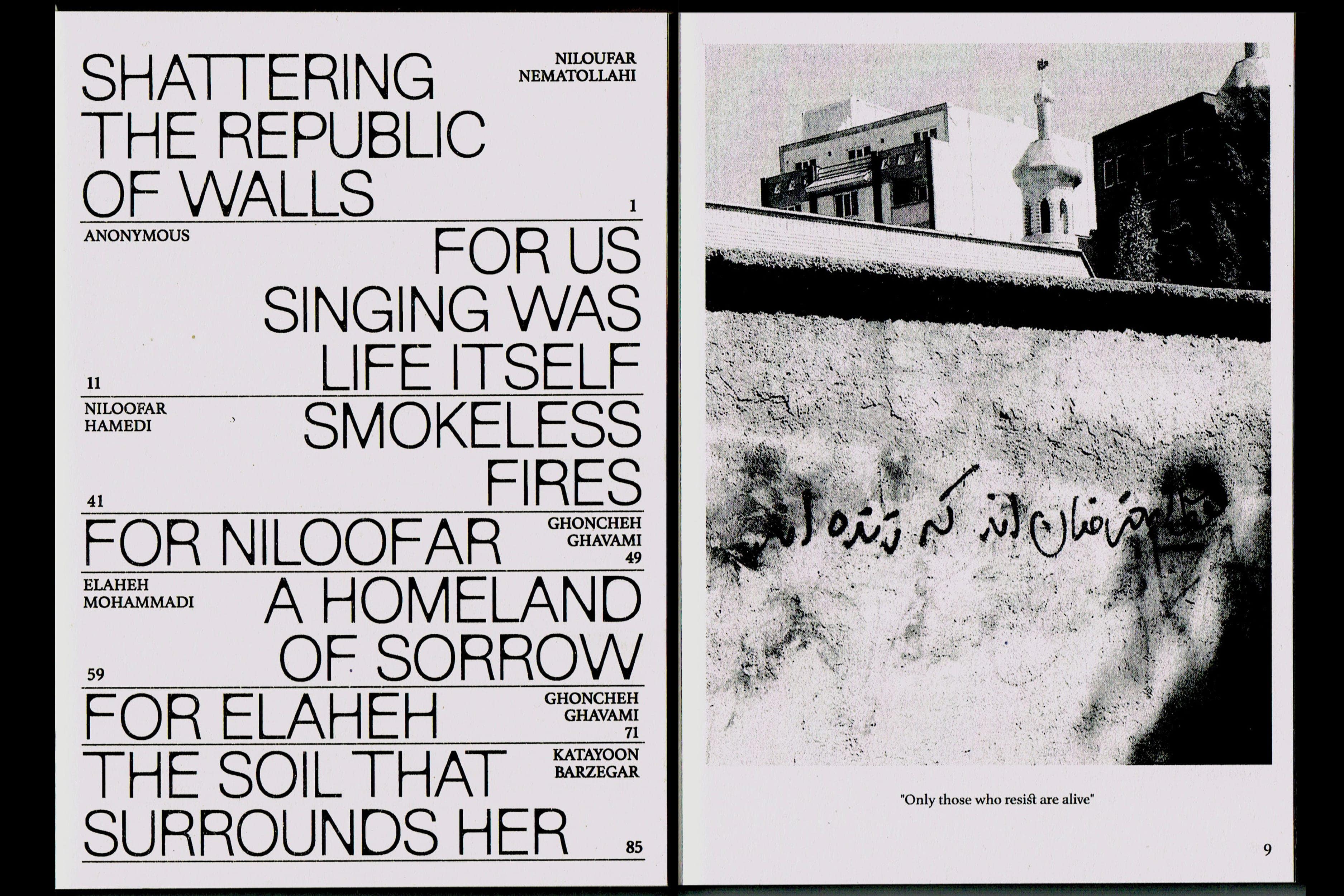
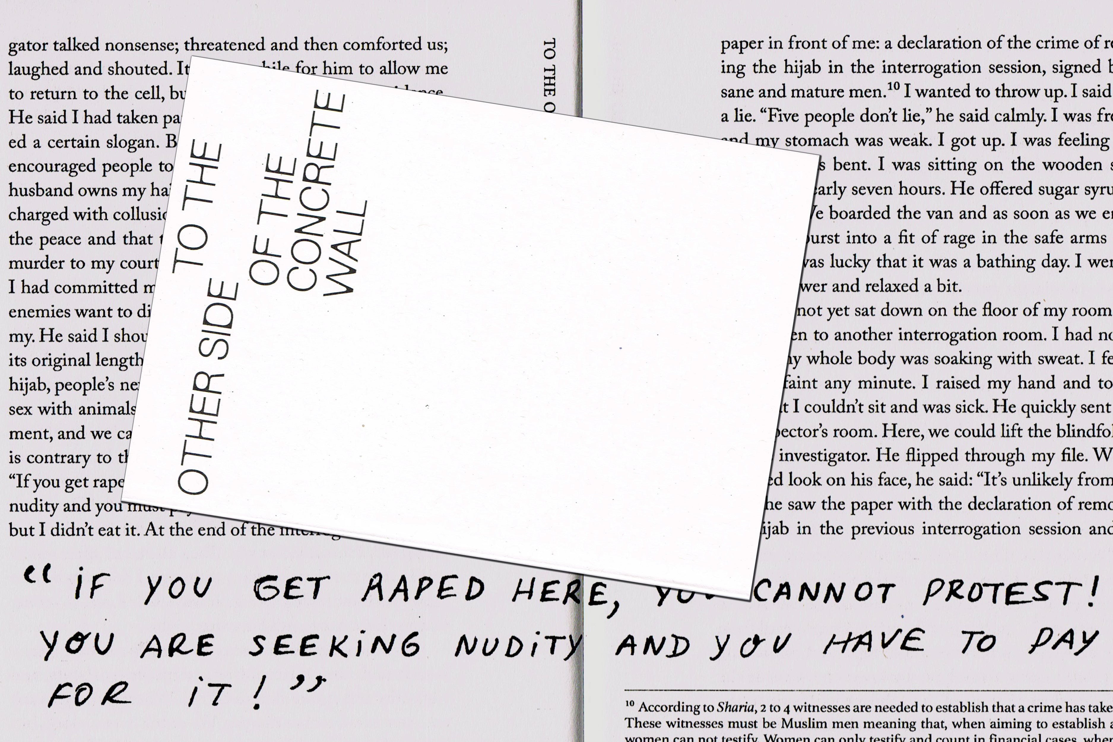
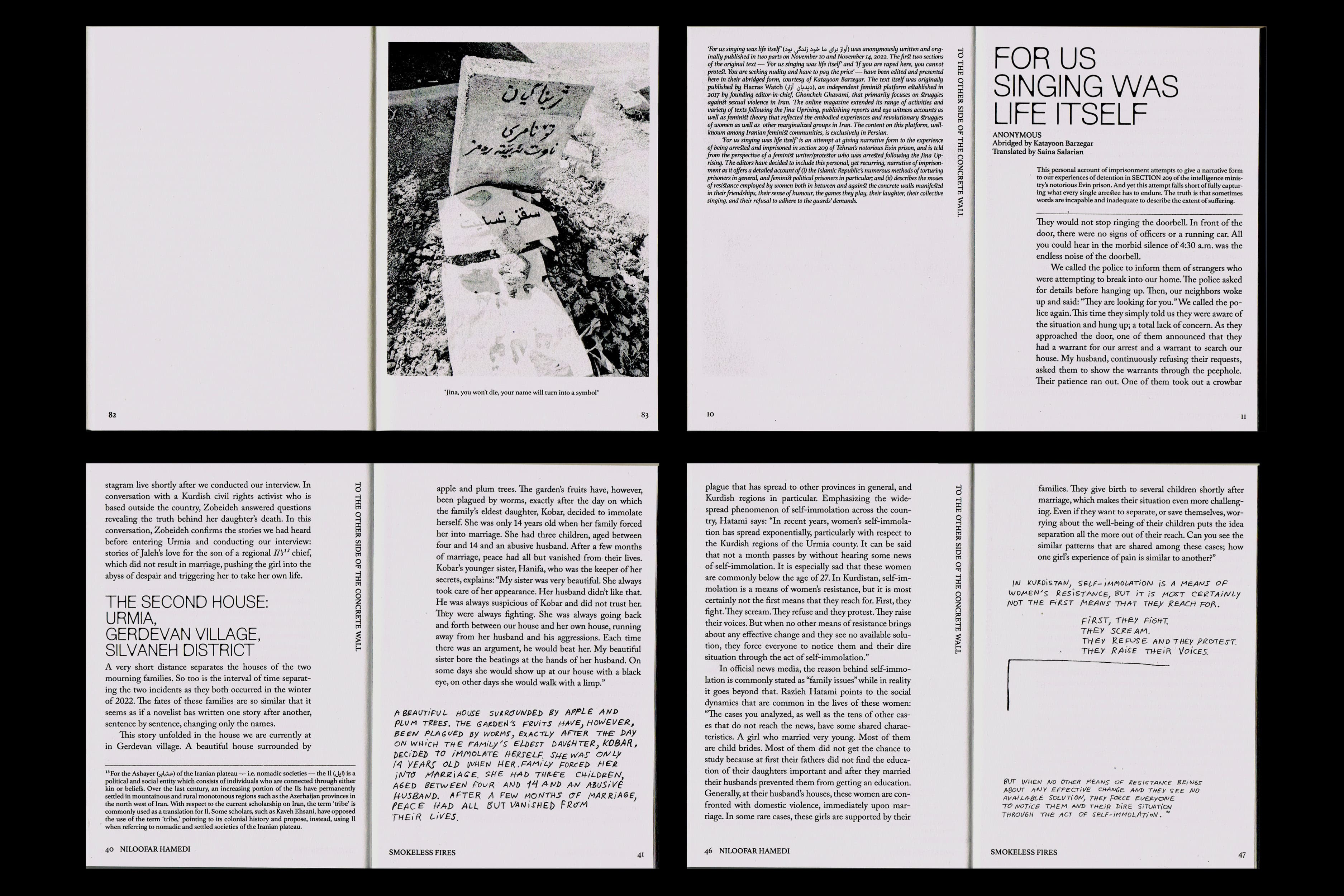
To The Other Side of The Concrete Wall
[2023] Published by Jina Collective with support from BAK, basis voor actuele kunstst, Utrecht Editors Katayoon Barzegar Niloufar Nematollahi Jose Rosales Essays Ghoncheh Ghavami Niloofar Hamedi Elaheh Mohammadi Translation Saina Salarian Nina Vabab Niloufar Nematollahi Proofreading Mahan Moalemi Rawan Bouststany Design Samuel Salminen Francisco Baquerizo Racines Printing no kiss? Paper Holmen Trend 70g/m² Holmen Trend Vintage 70g/m² Typefaces NewEdge666 by Charlotte Rohde Adobe Caslon by Carol Twombly Athelas by José Scaglione, Sahar Afshar & Veronika Burian
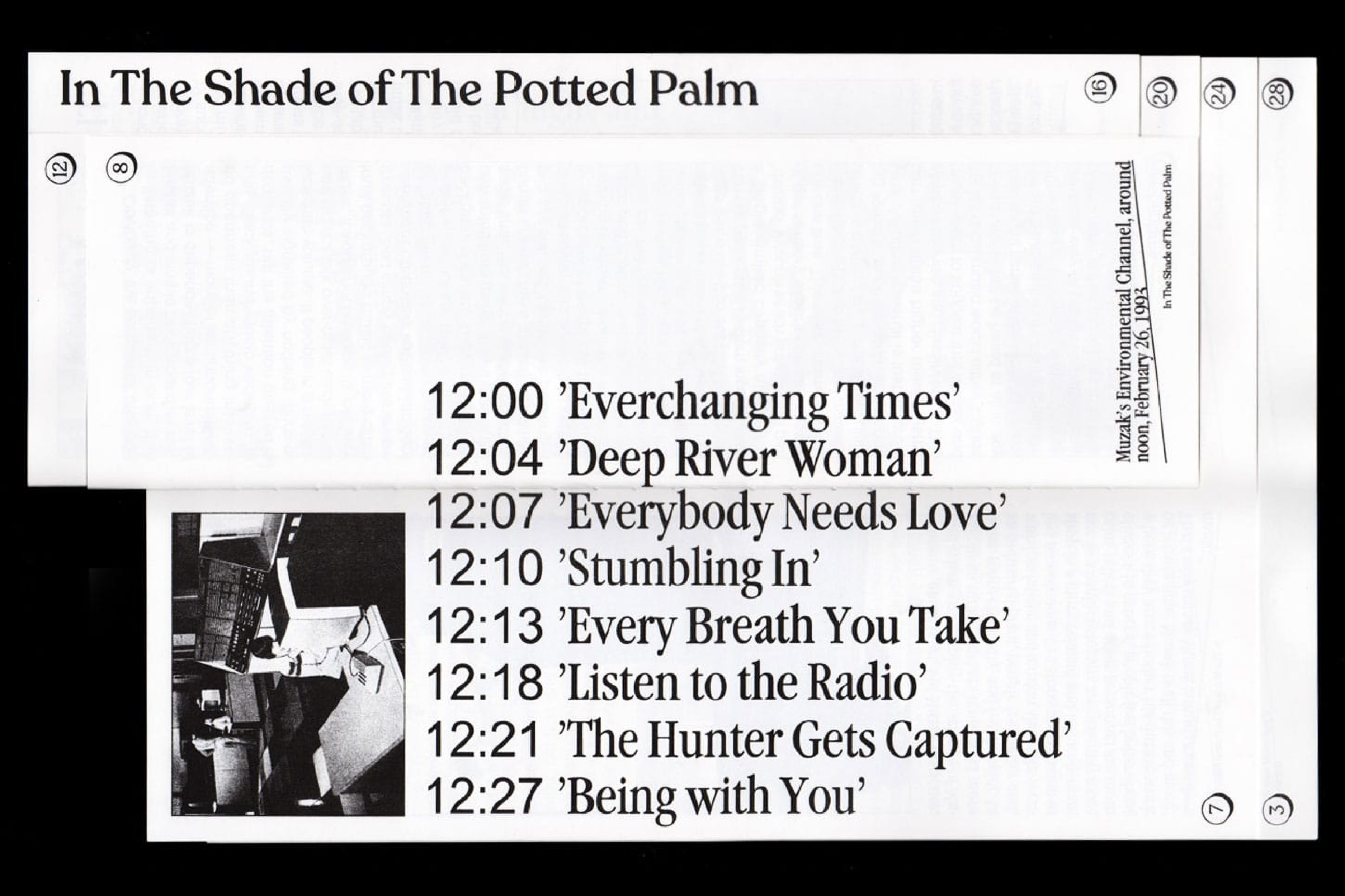
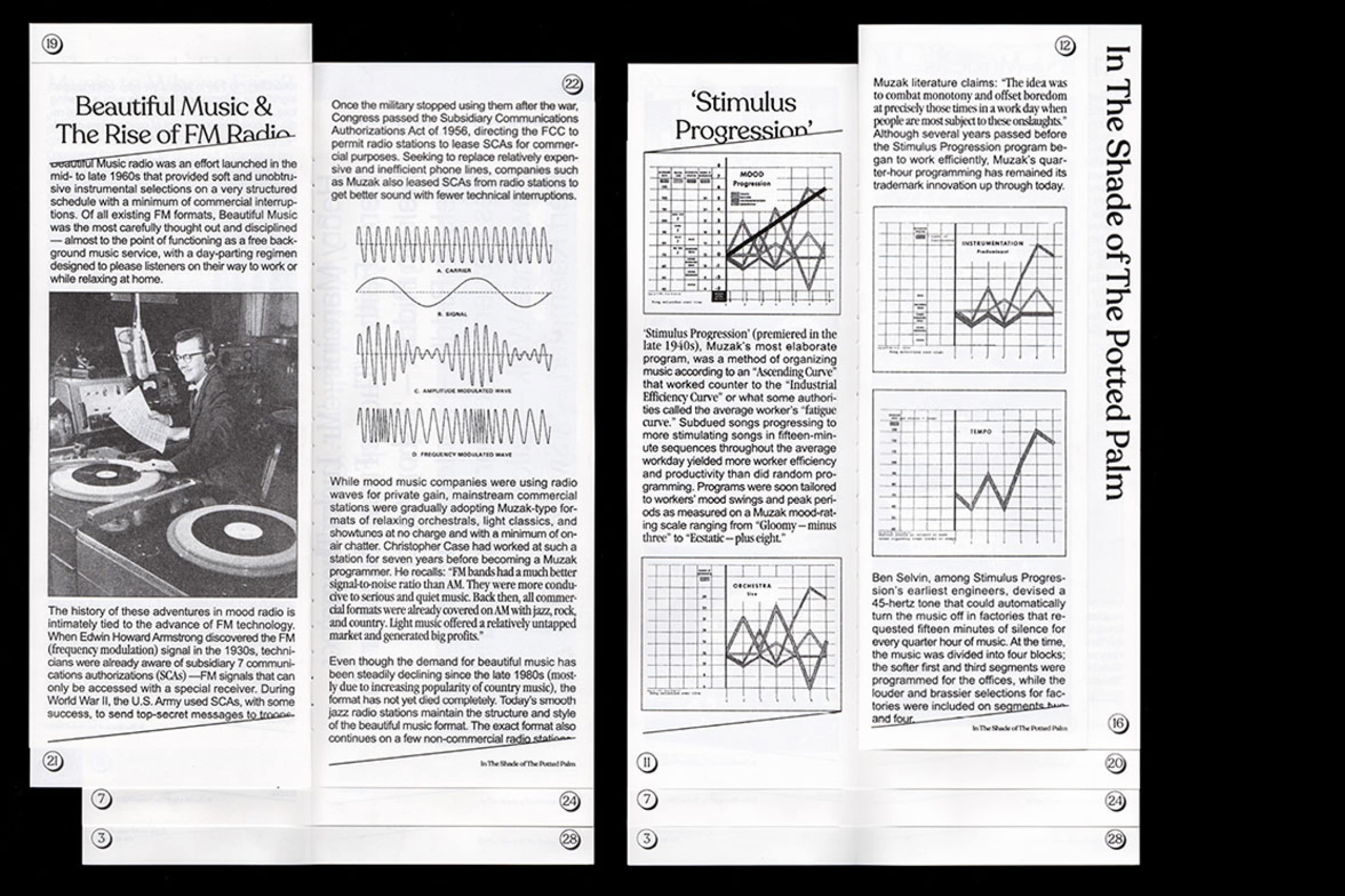
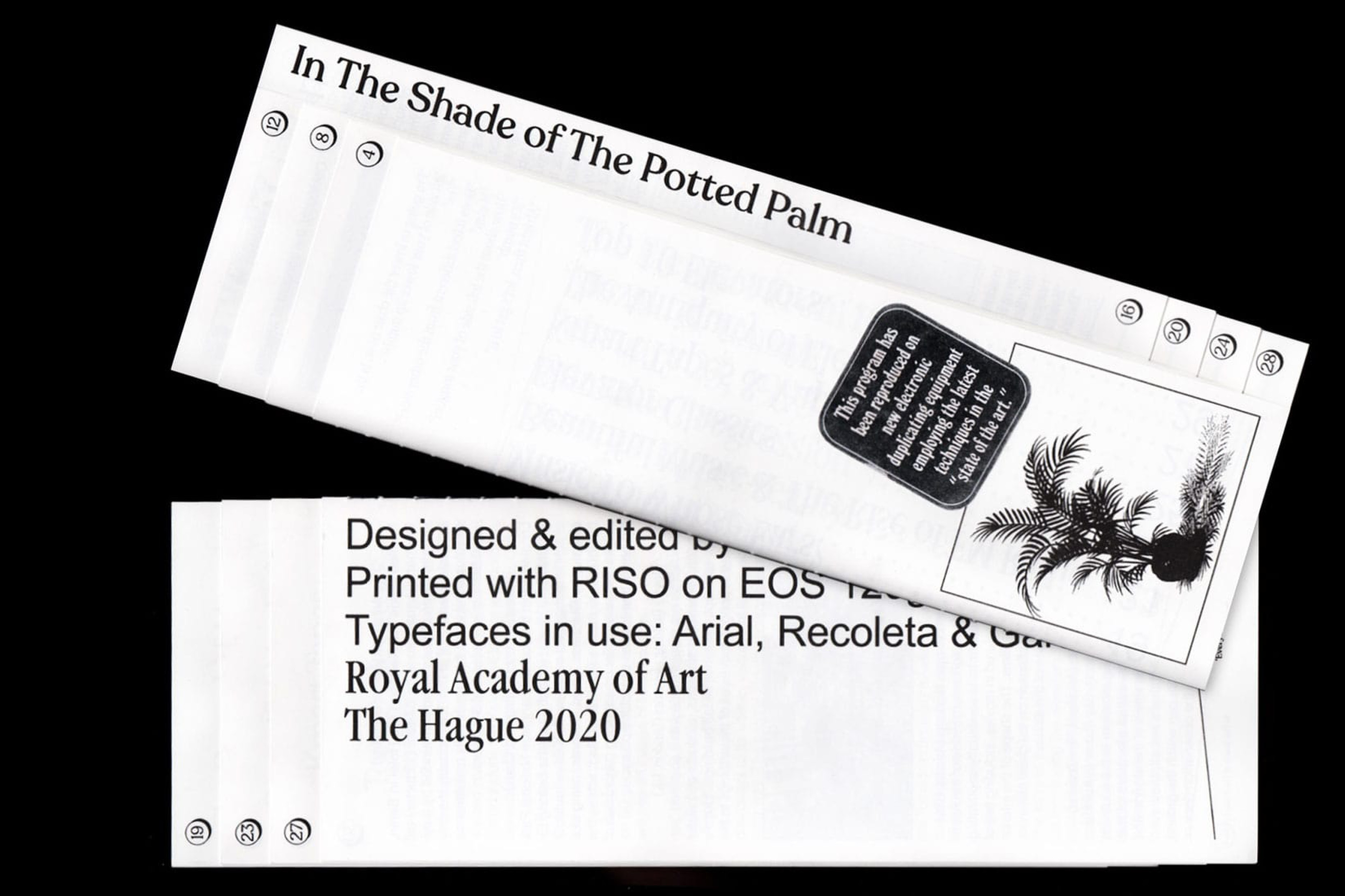
In The Shade of The Potted Palm
[2020] A publication on the rise and fall of elevator music, its impact on pop-culture and human psychology and the traces it left behind. RISO-printed 30 Pages Typefaces: Garamond Narrow by Tony Stan Arial by Robin Nicholas & Patricia Saunders Recoleta by Jorge Cisterna
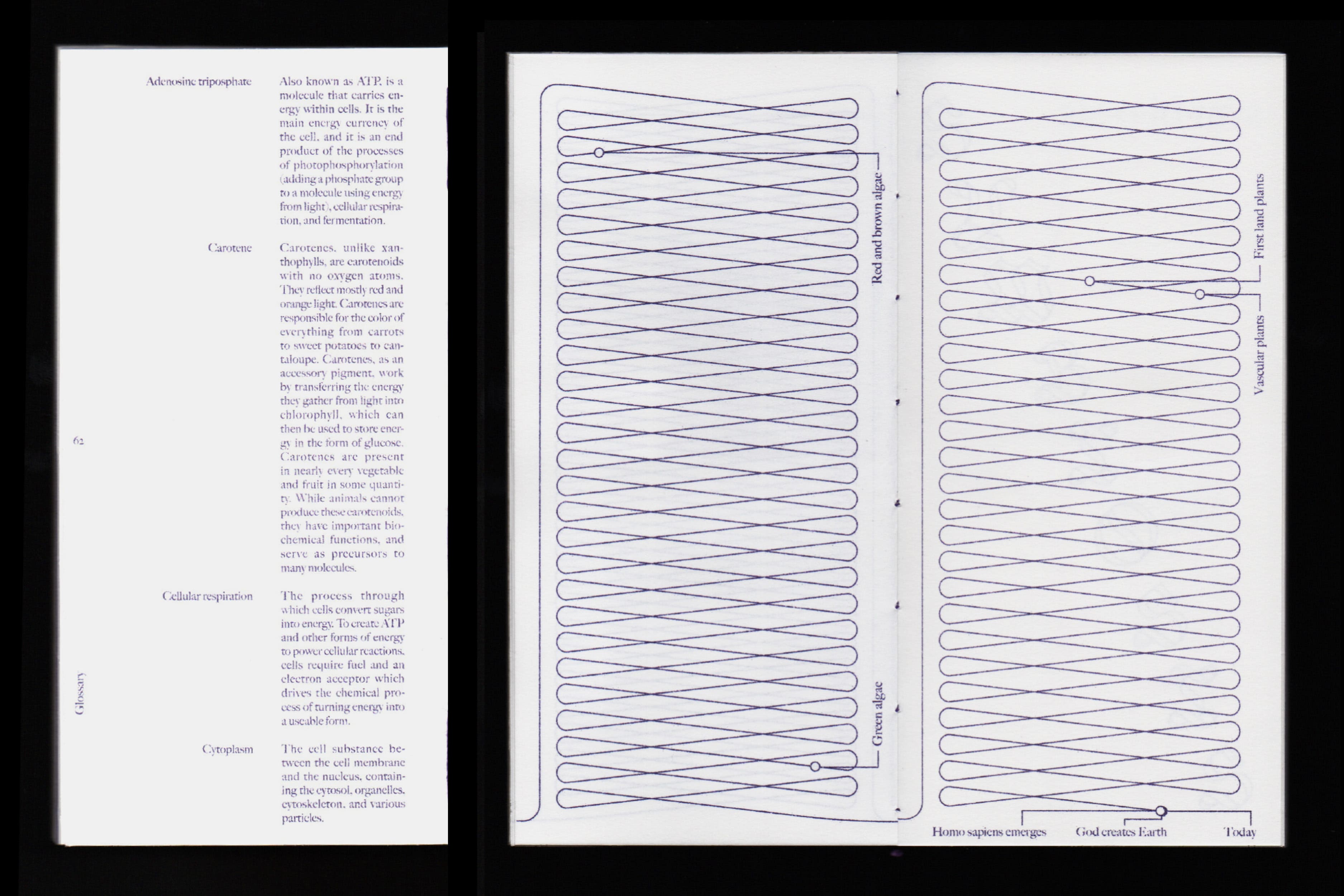
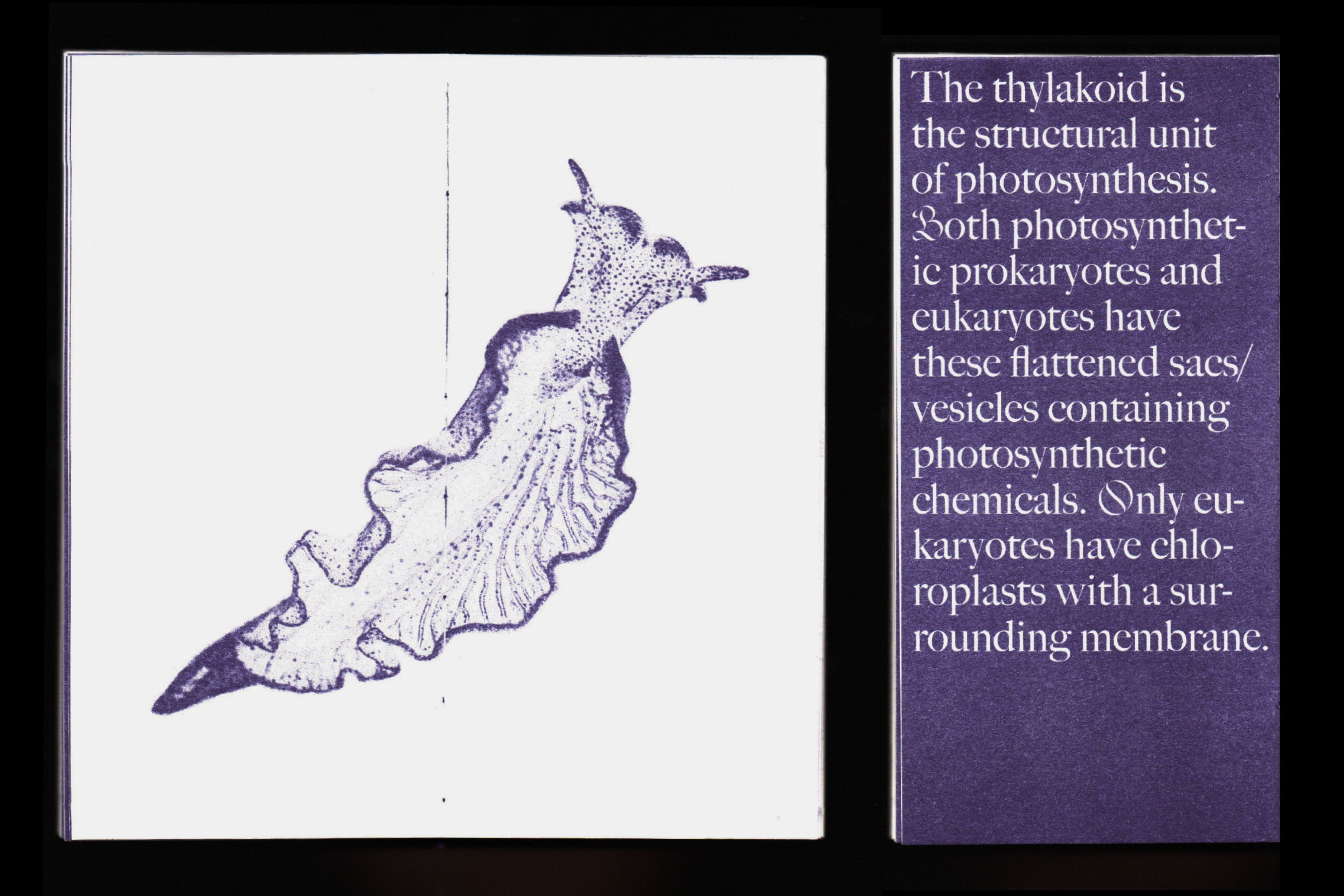
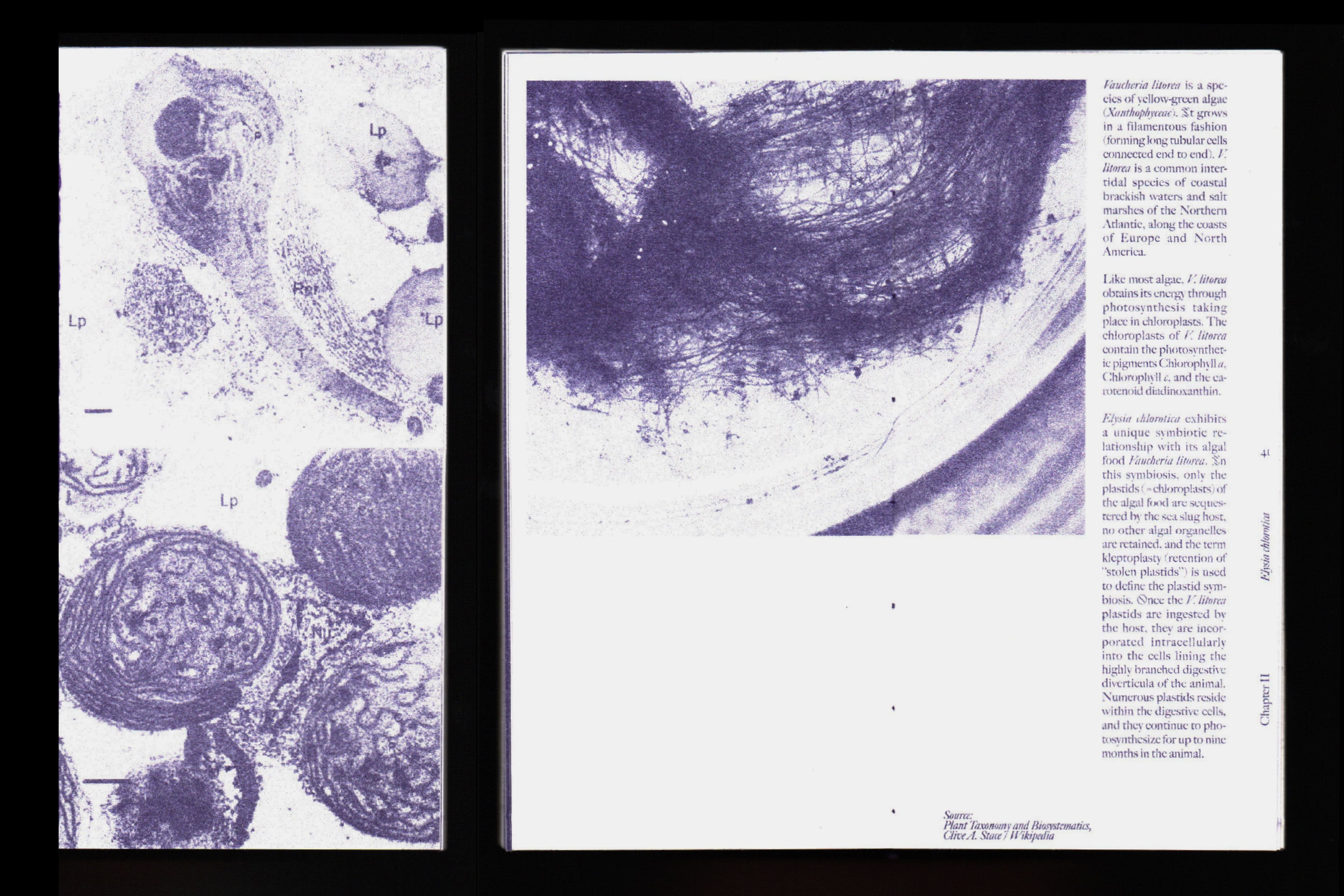
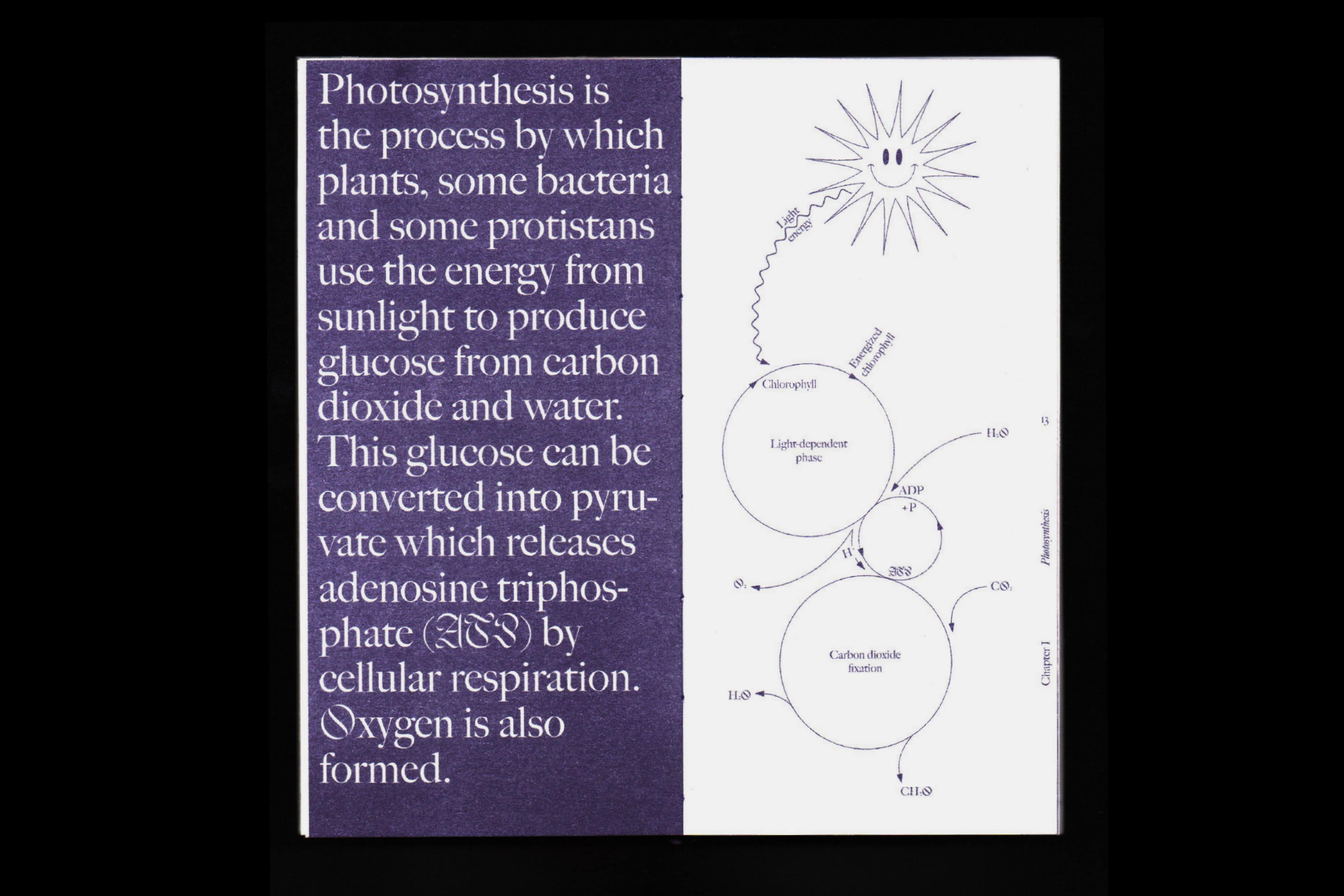
Symbiosis
[2019] A research-focused publication discussing the possibilities of us humans having the ability to photosynthesize by looking into the mysteries of horizontal gene transfer and by examining the symbiotic relationship between a solar-powered sea slug and its algal food. RISO-printed 72 pages Typefaces: Big Caslon by Matthew Carter Jabin by Frida Medrano
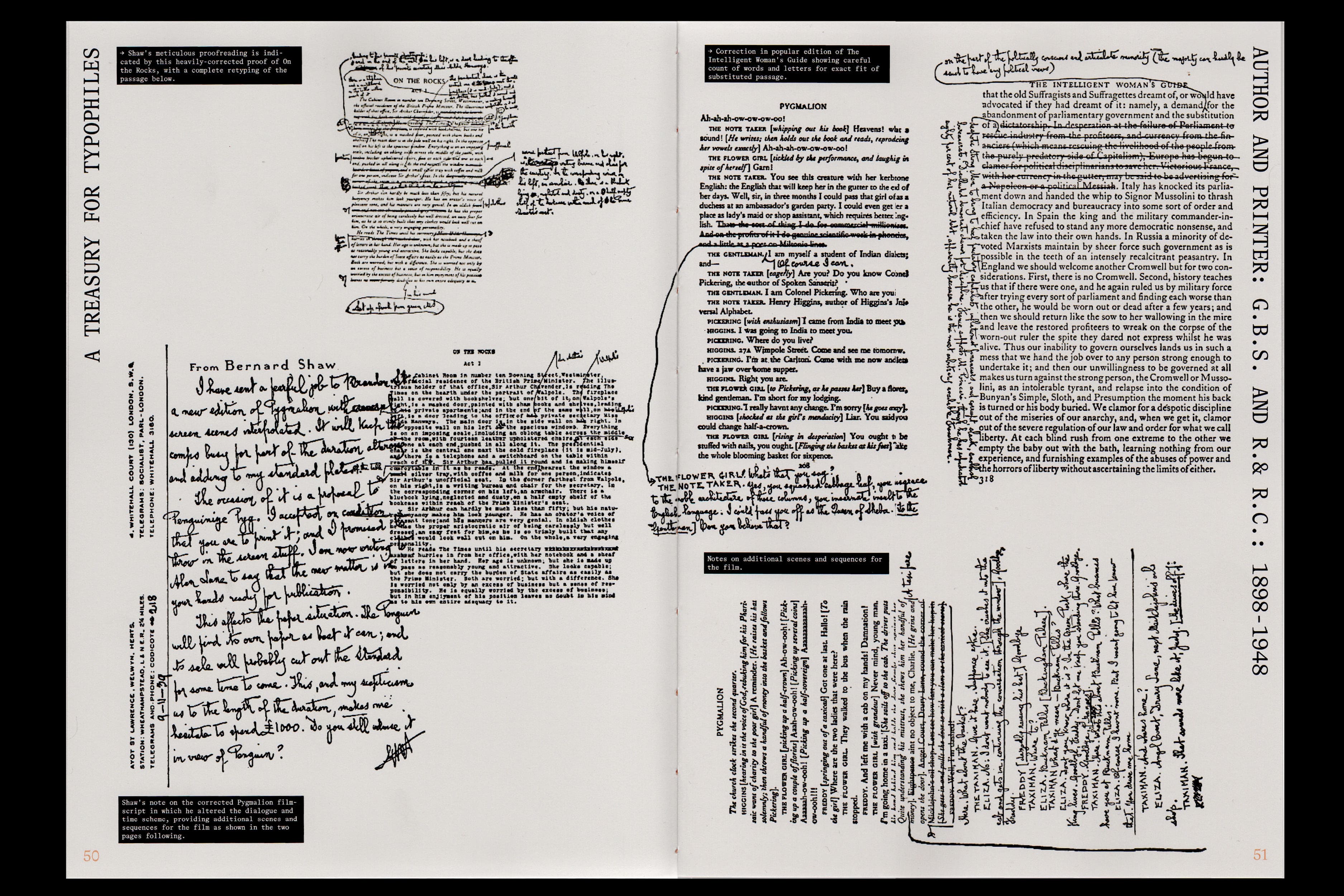
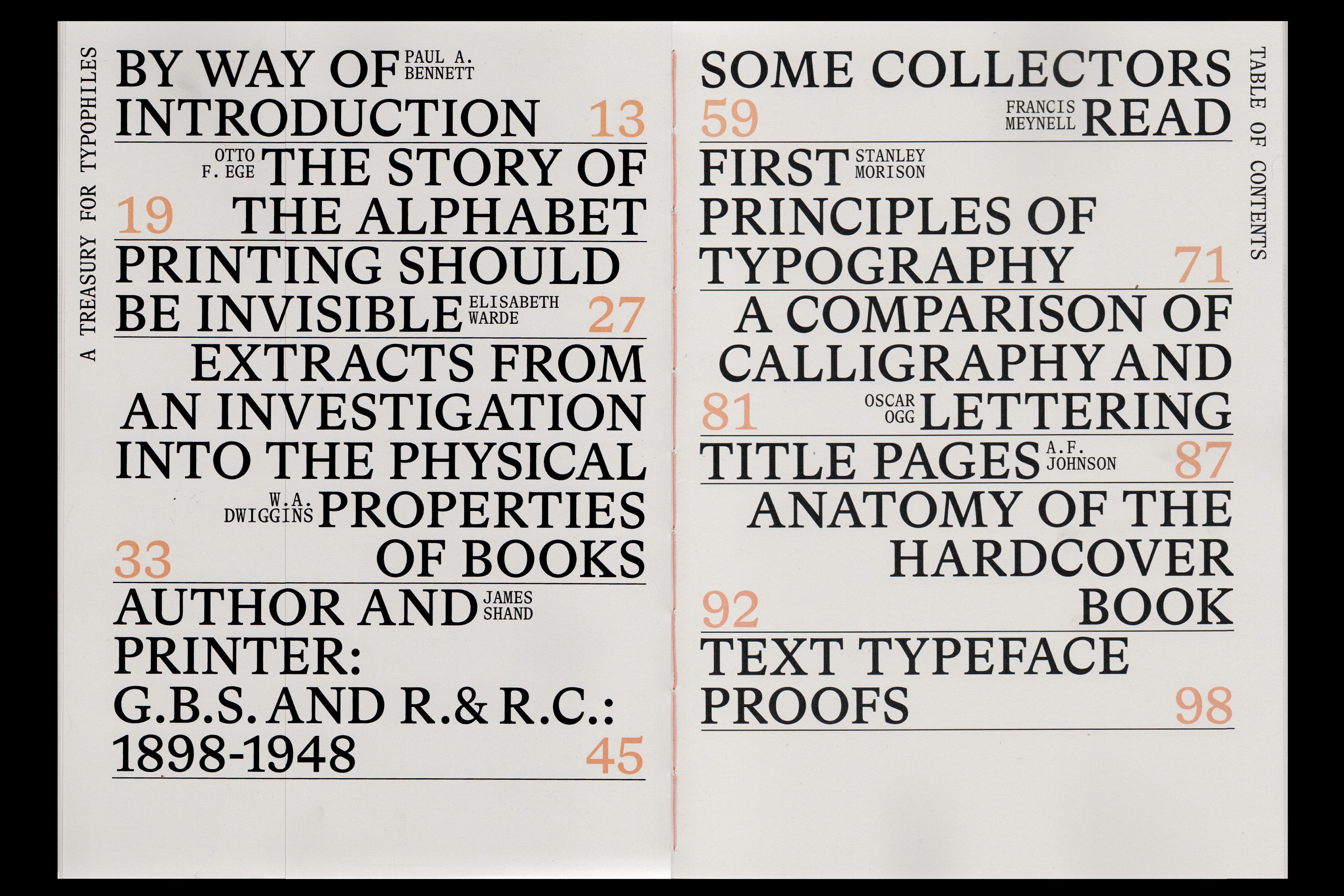
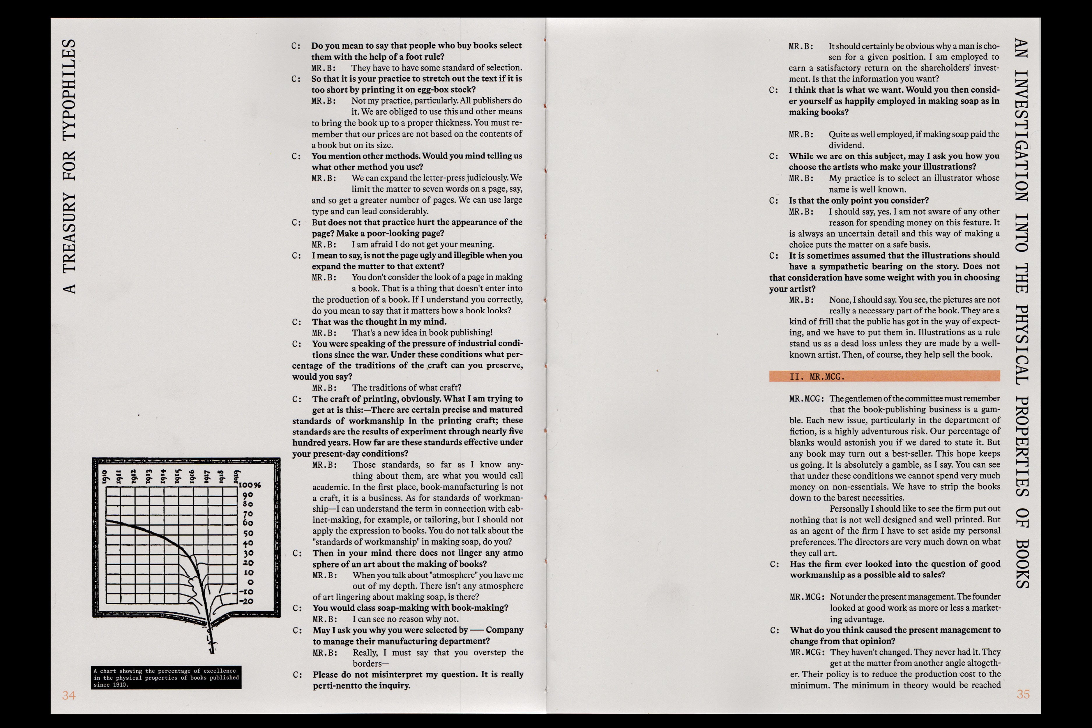
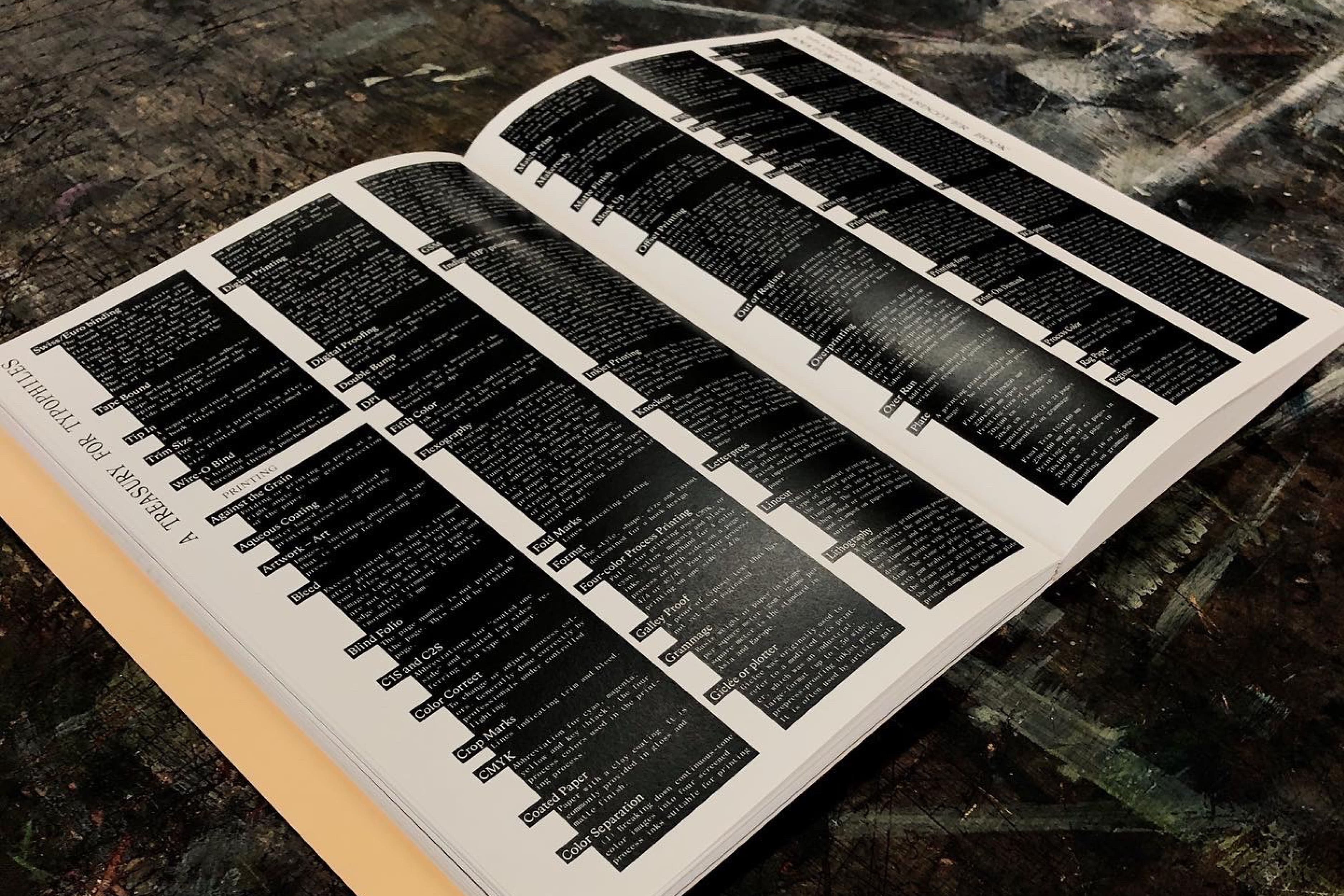
A Treasury for Typophiles
[2021] A collection of essays on bookmaking and typography.
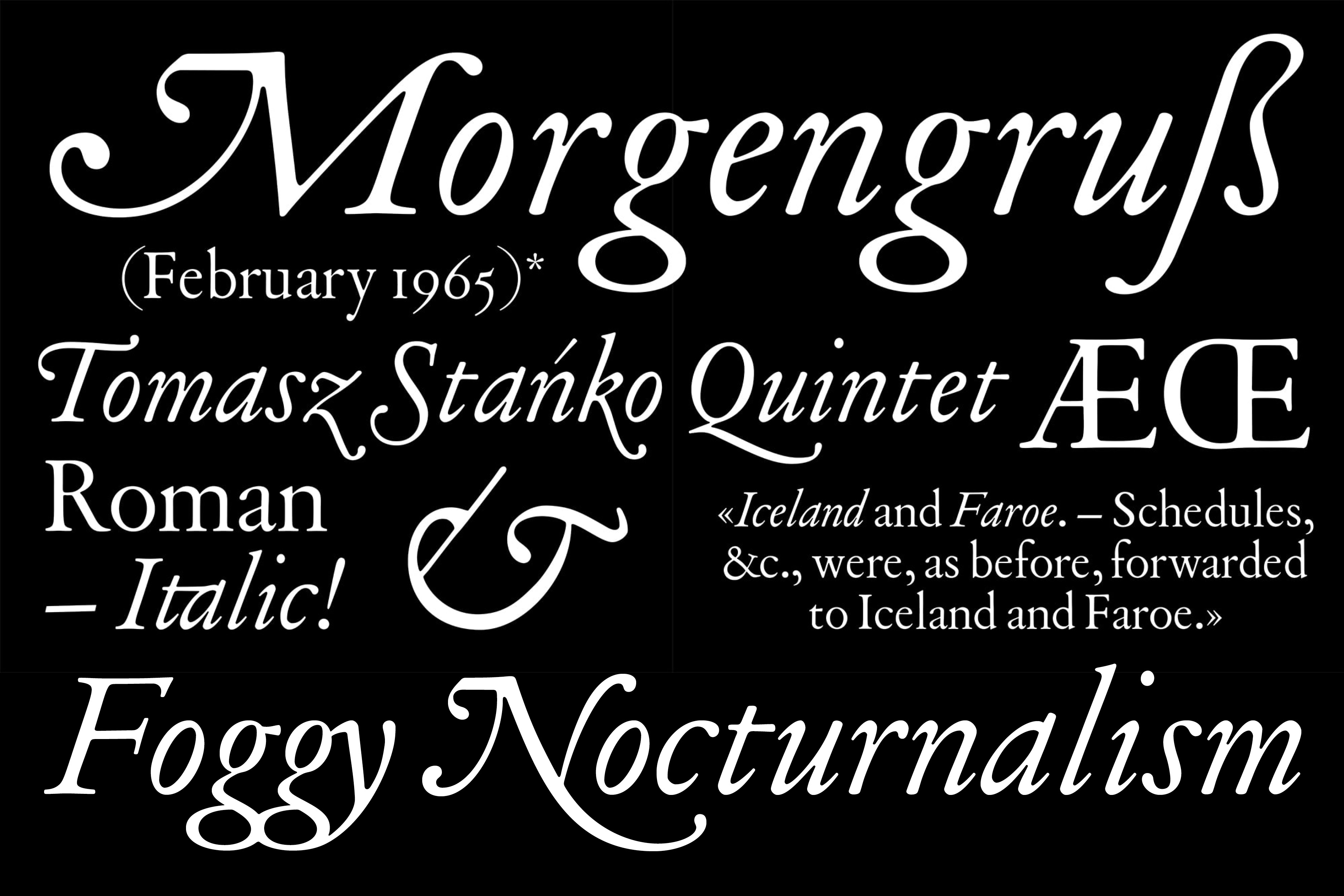
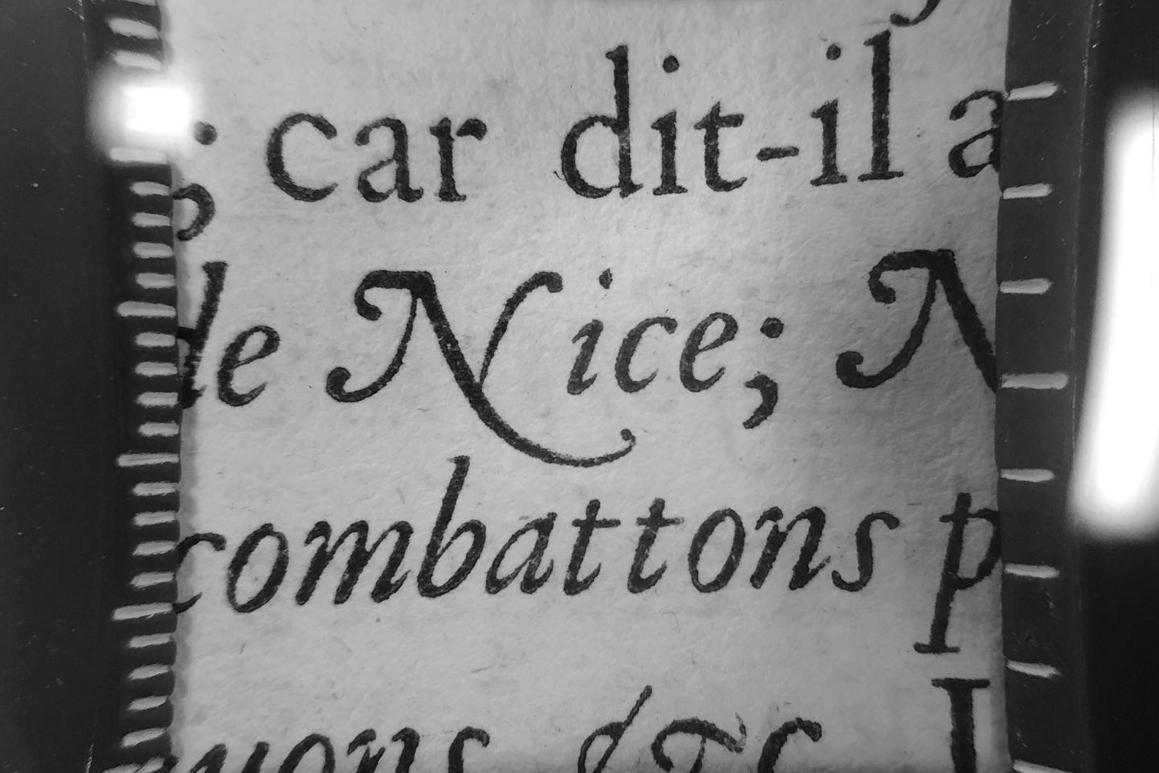
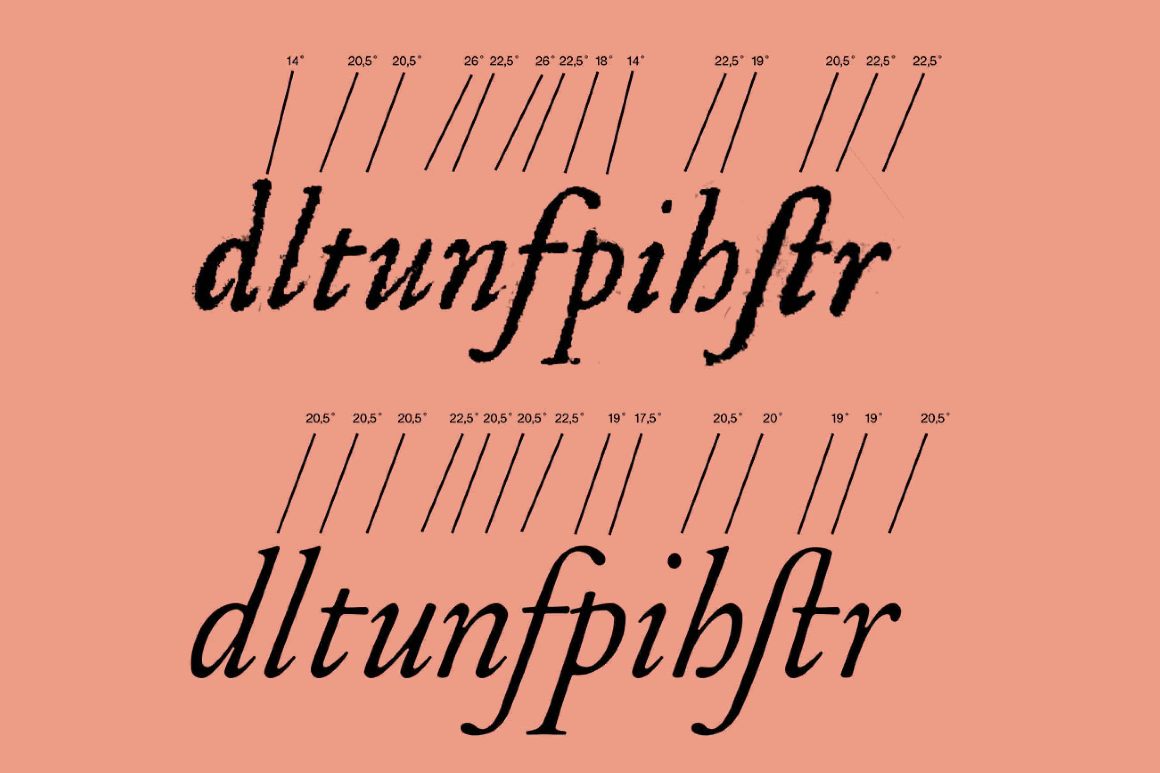
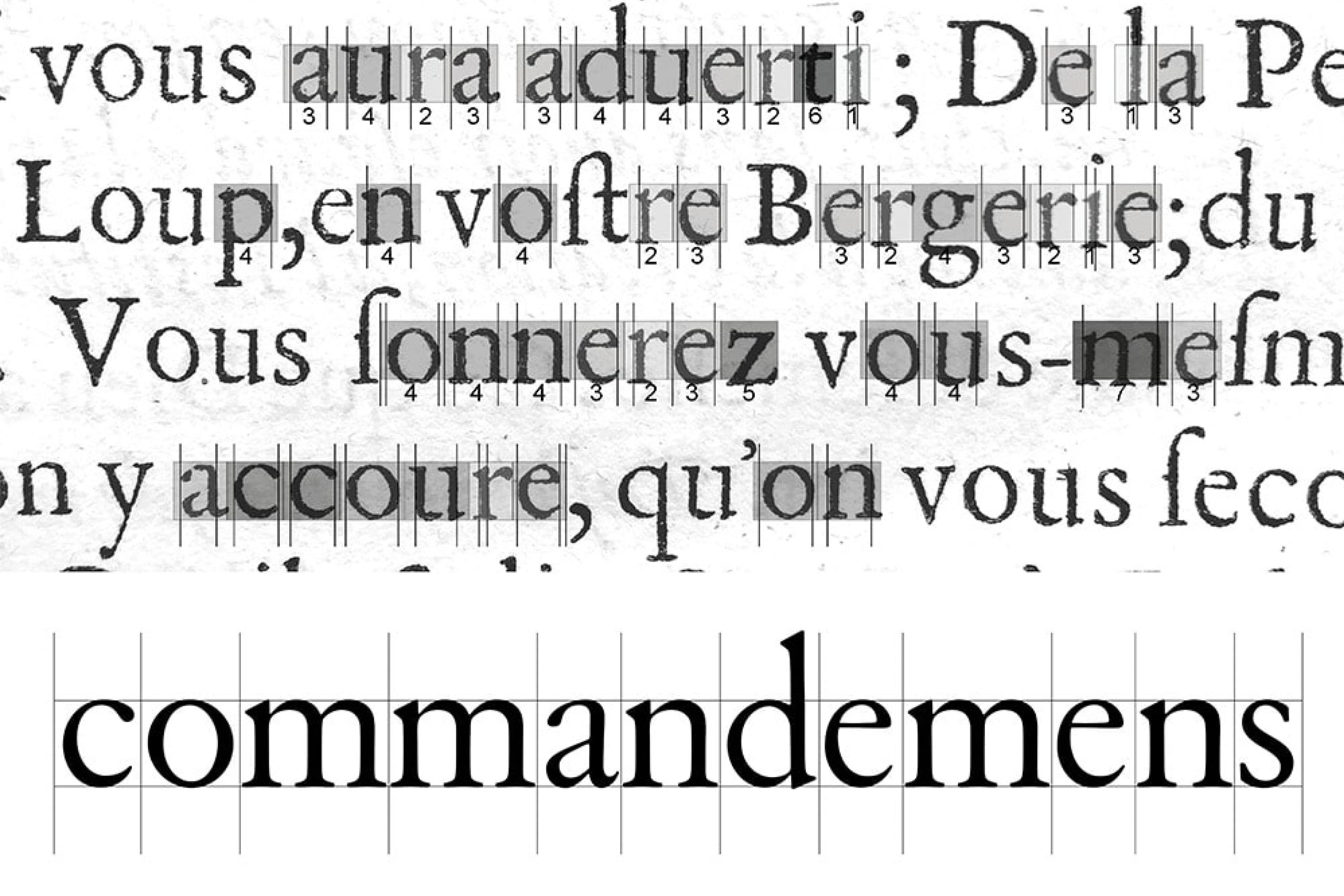
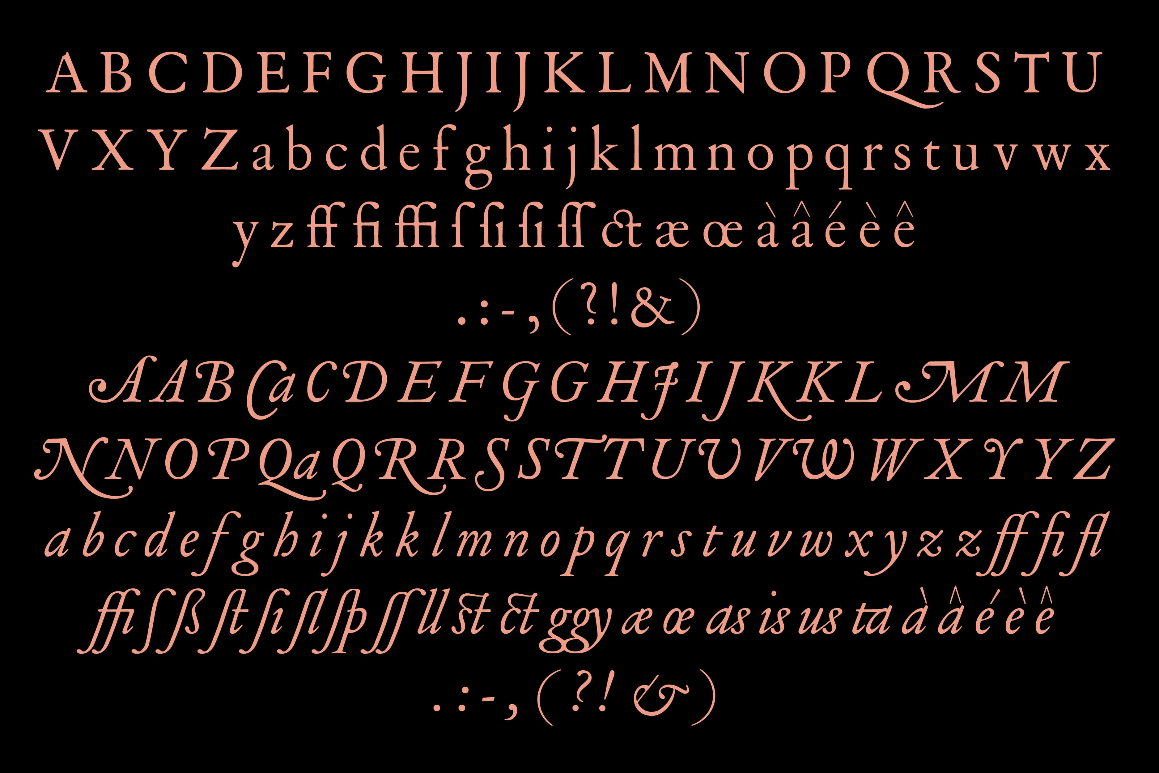
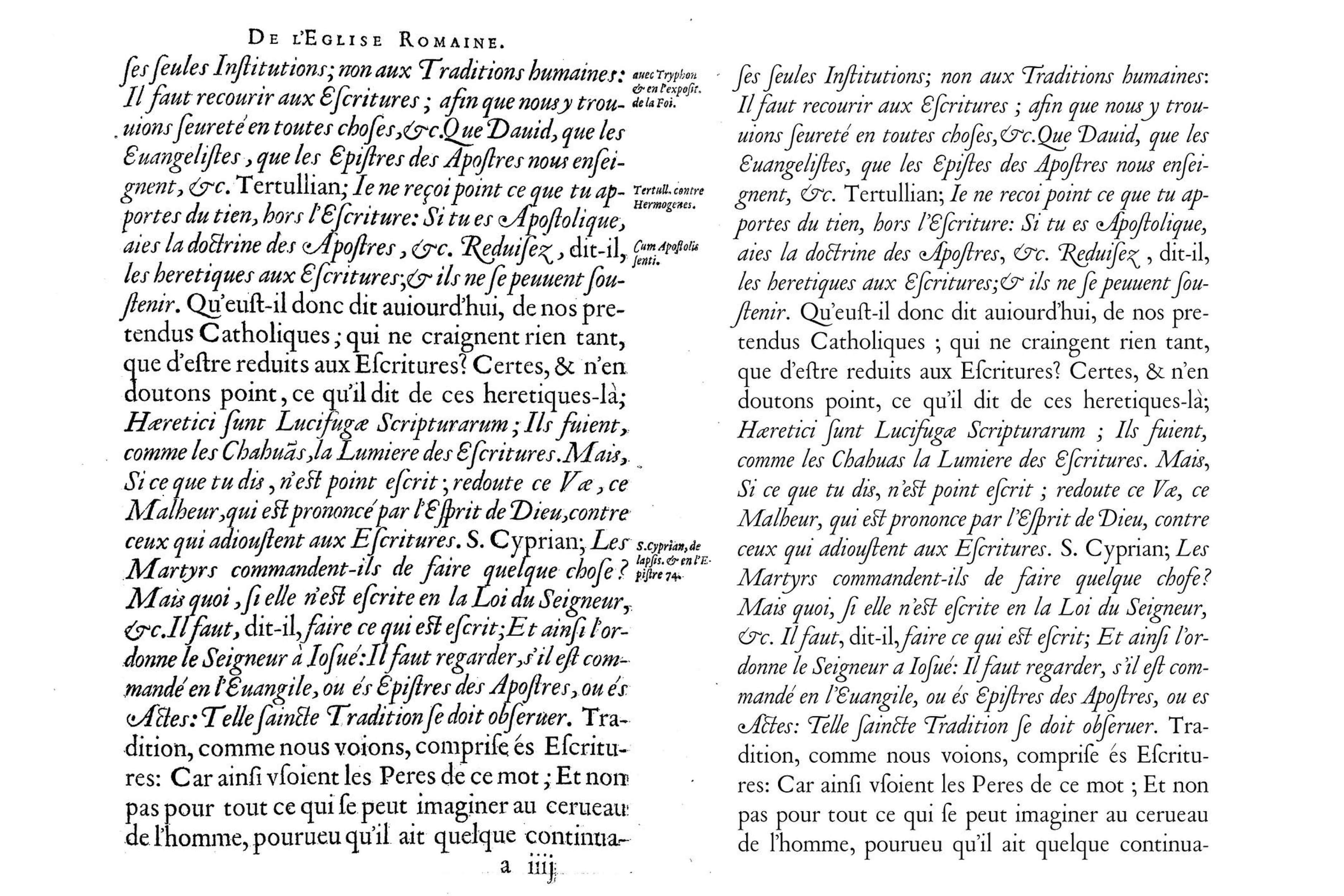
Hieronimus — A Study of French Renaissance Type
[2021] By Barbara Strzeżek, Lara Dautun & Samuel Salminen under guidance of Dr. Frank E. Blokland Revival of Renaissance types by Pierre Haultin and Francois Guyot. The source material for this work was De l'institution, usage et doctrine du sainct sacrament, published by Ph. de Mornay (La Rochelle, H. Haultin, 1598). The project included two styles; a roman lowercase derived from Guyot's Double-Pica (Ascendonica, Gros-parangon) (1544), most likely punched by a La Rochelle punch-cutter, paired with capitals of La Rochelle Double-Pica Roman by Haultin (1598) and Guyot's Double-Pica (Ascendonica, Gros-parangon) Italic (1557).
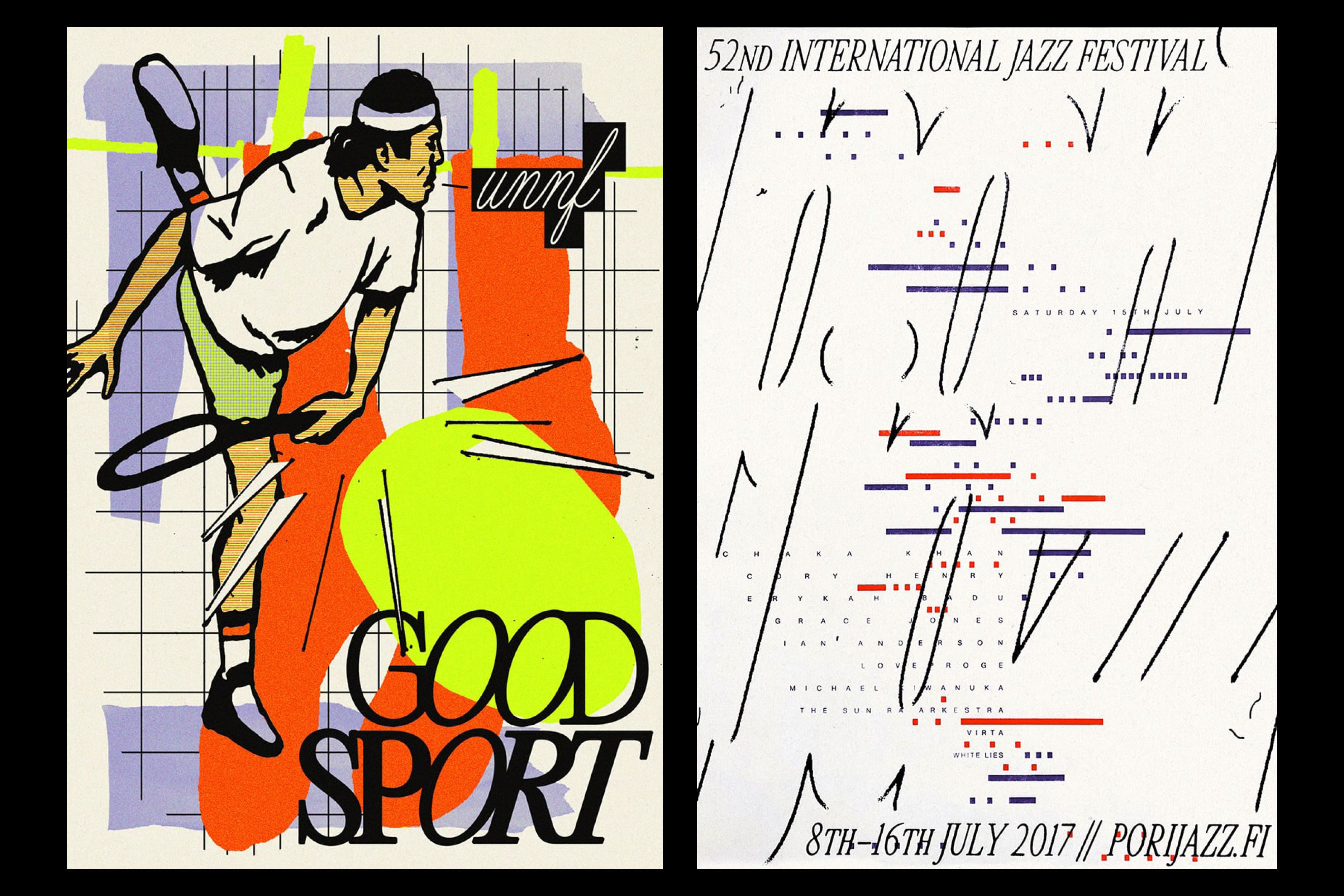
Selection of Posters
[2021–2022]
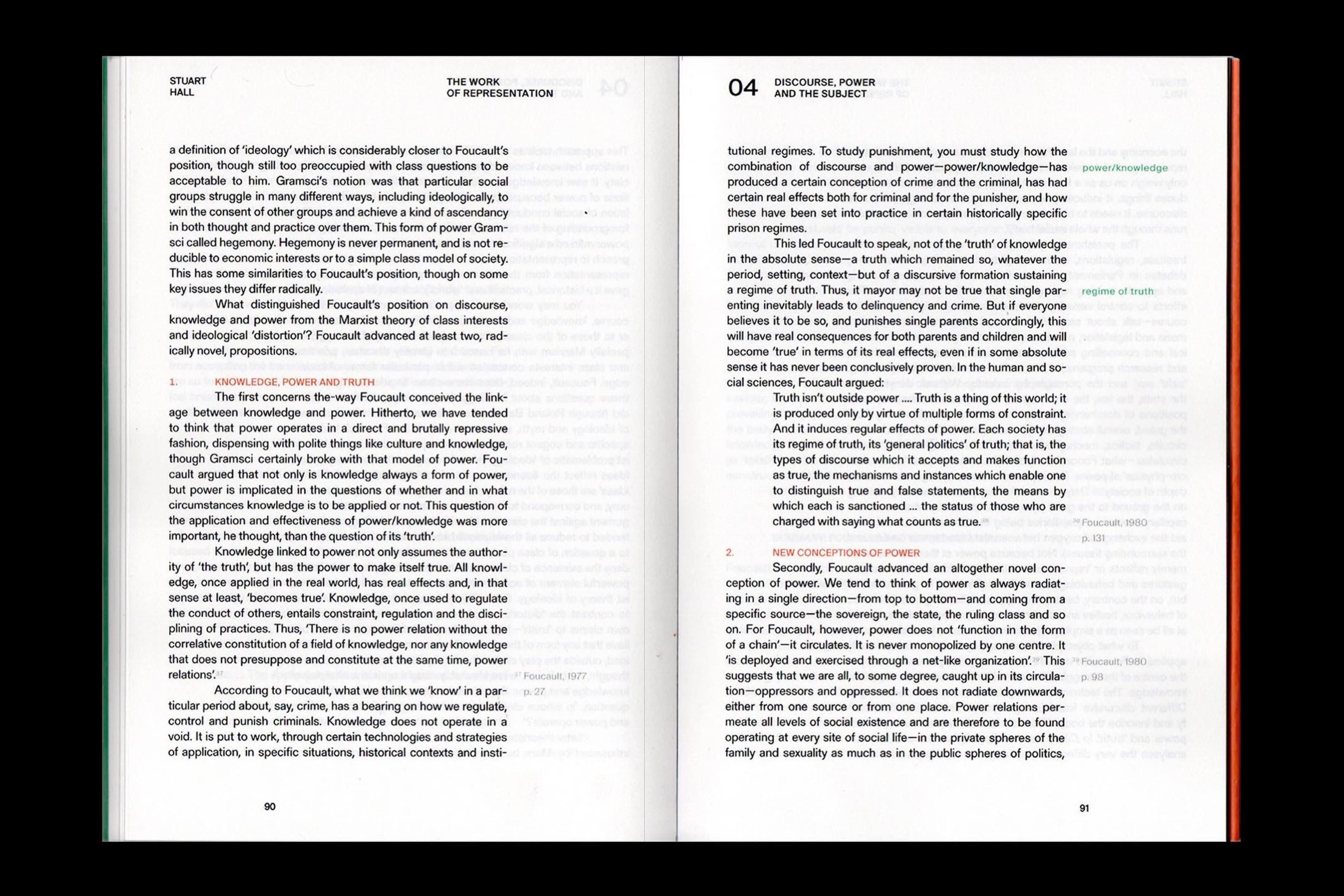
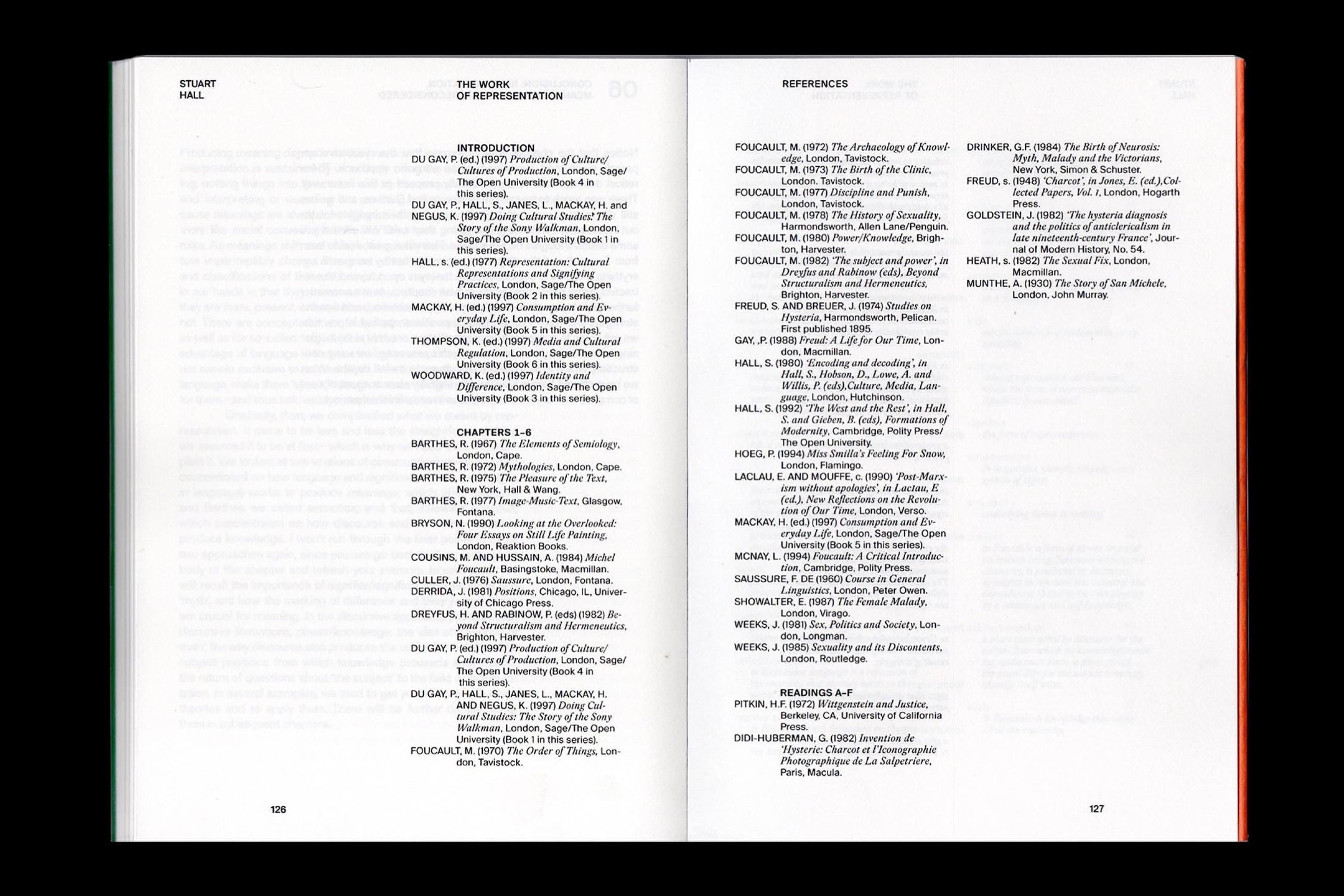
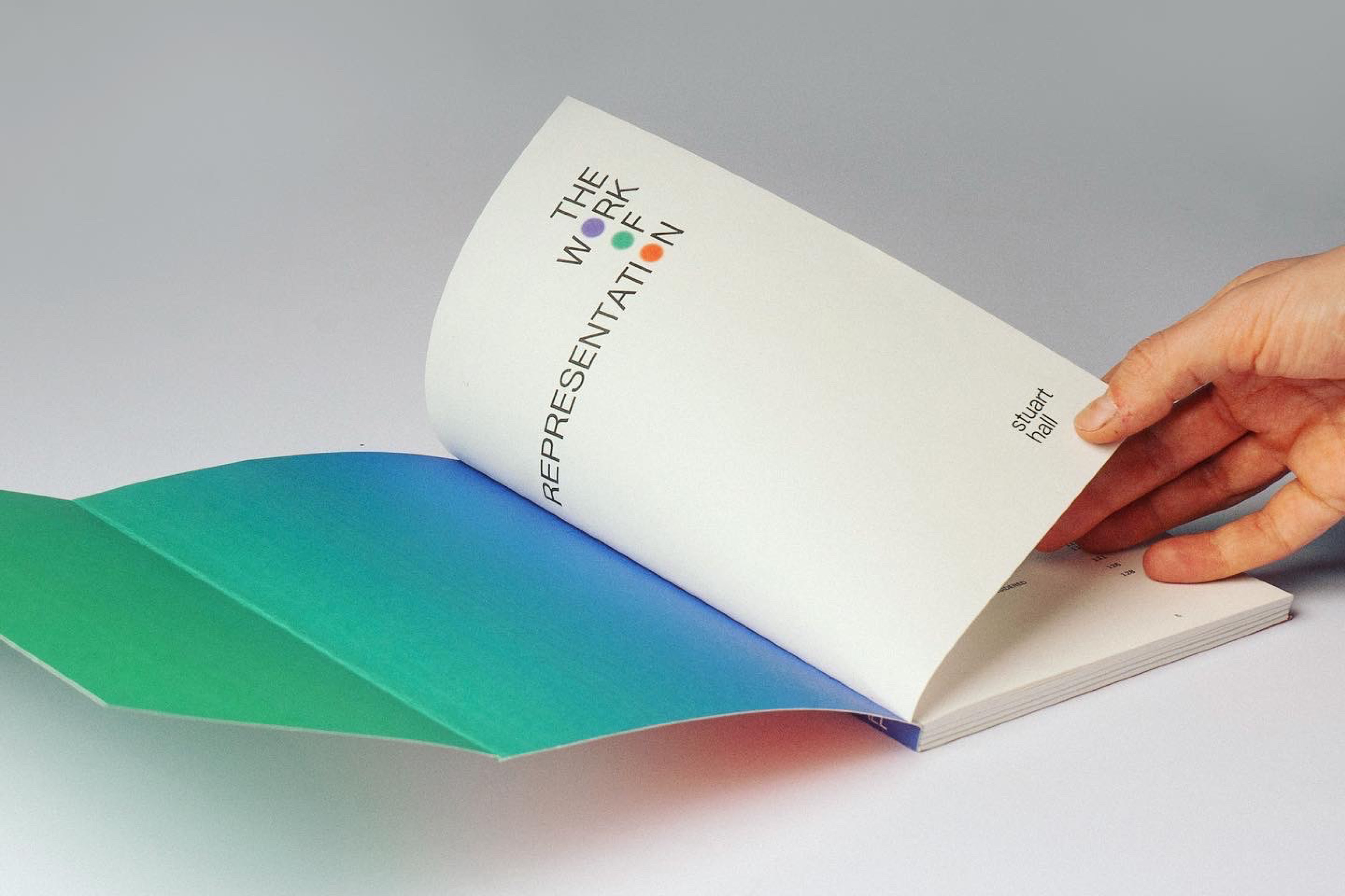
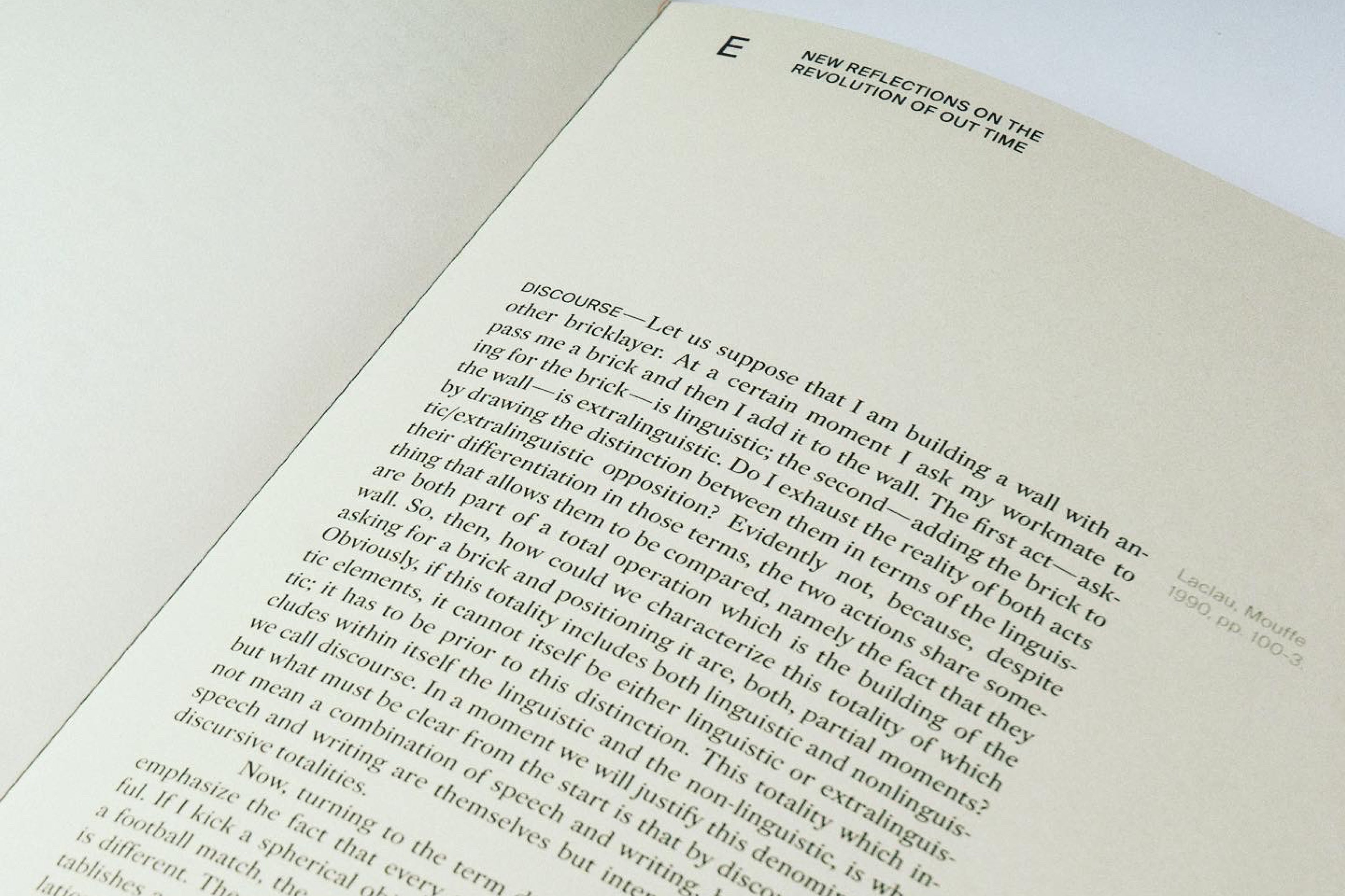
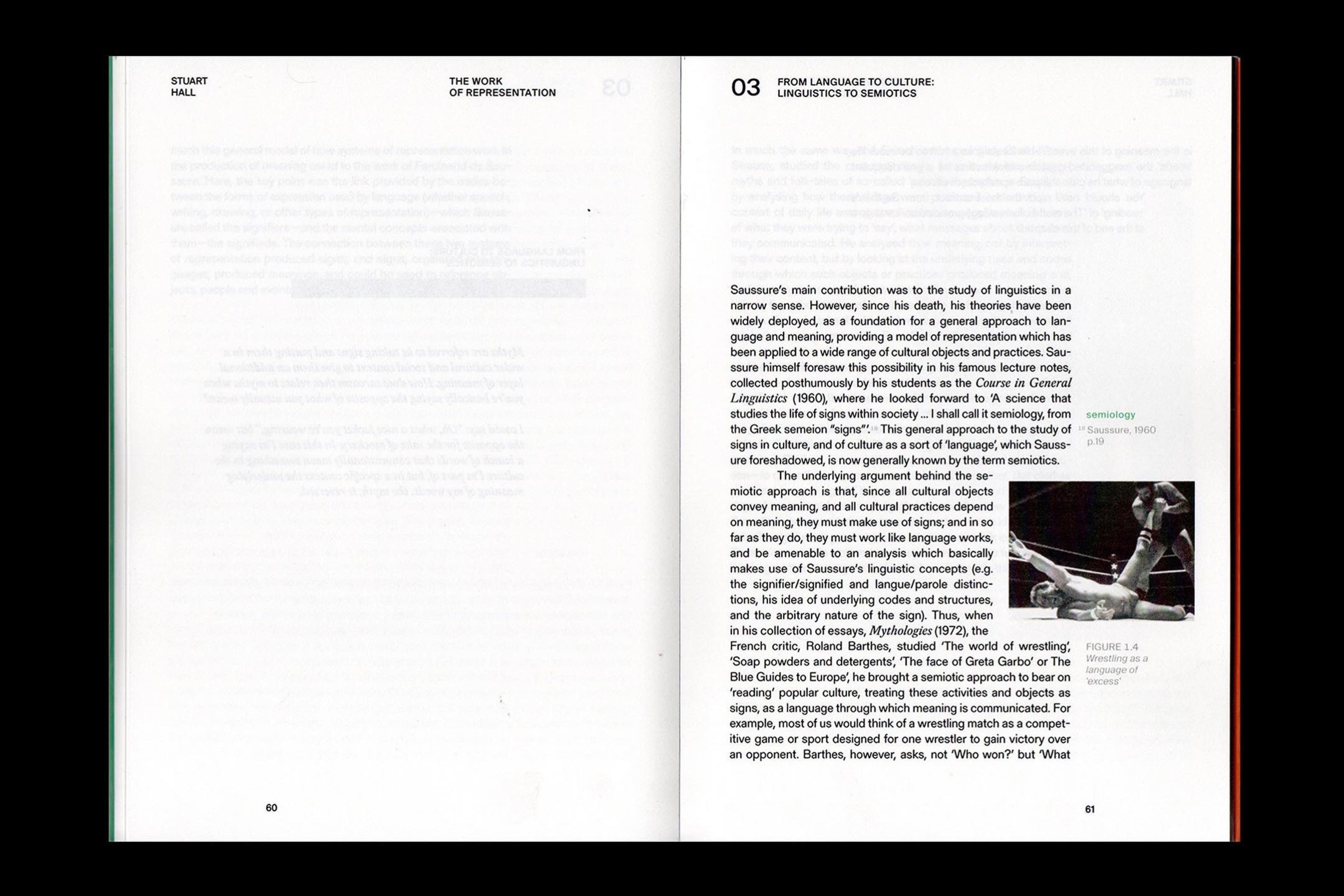
Work of Representation
[2021] Re-design of Stuart Hall's Work of Representation Collaboration with Basia Strzeżek
Custom Type and Identity
[2021] Programmed in p5.js
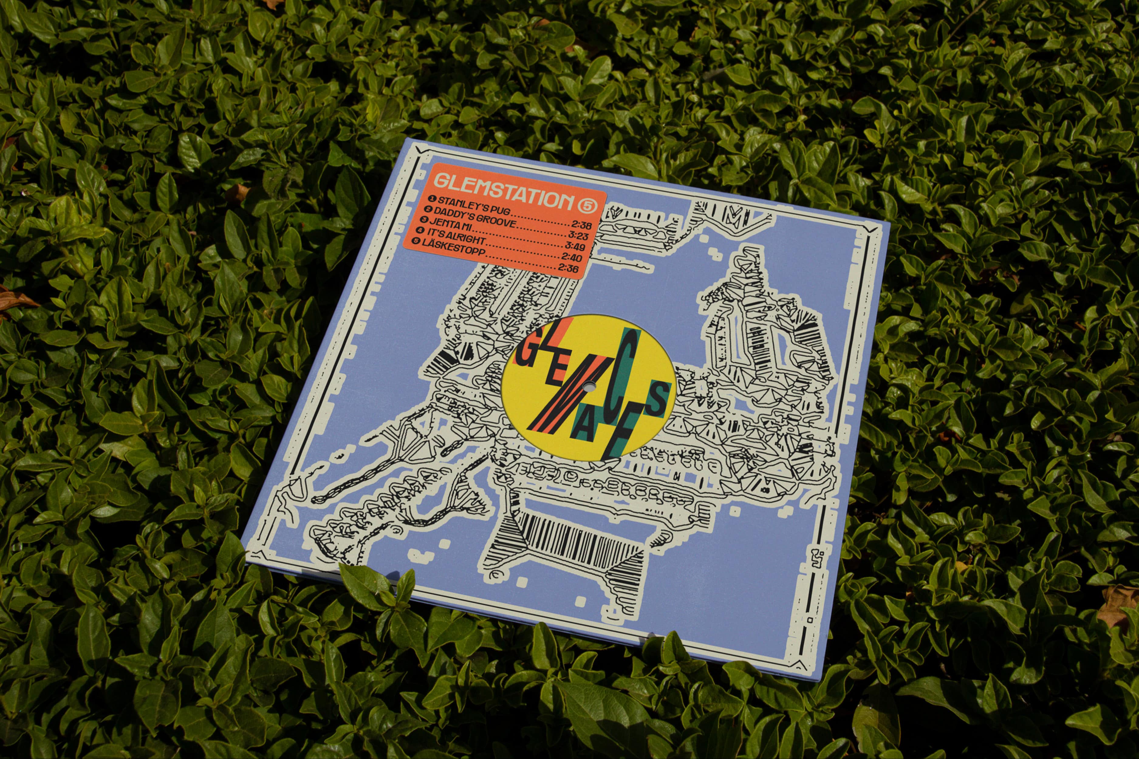
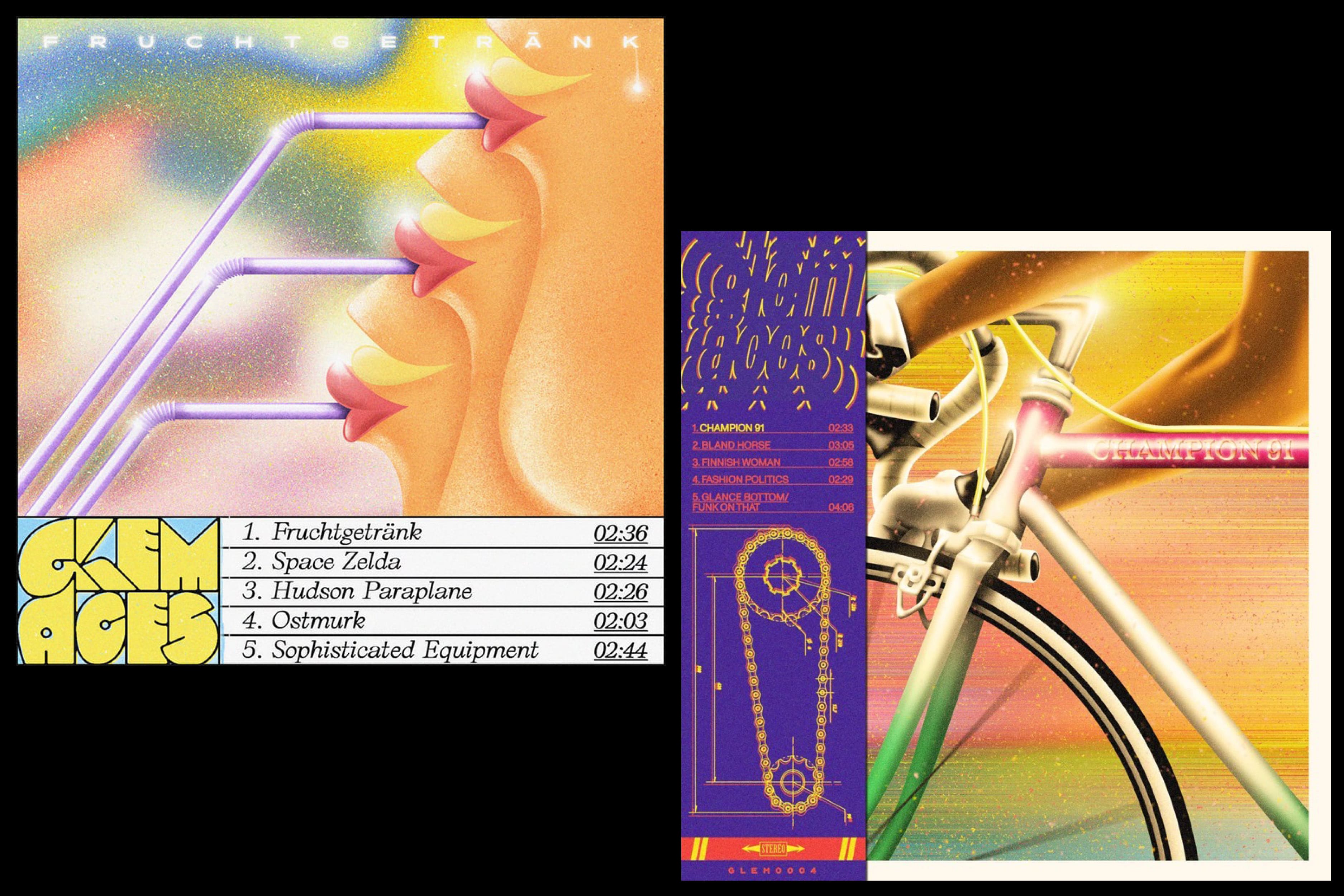
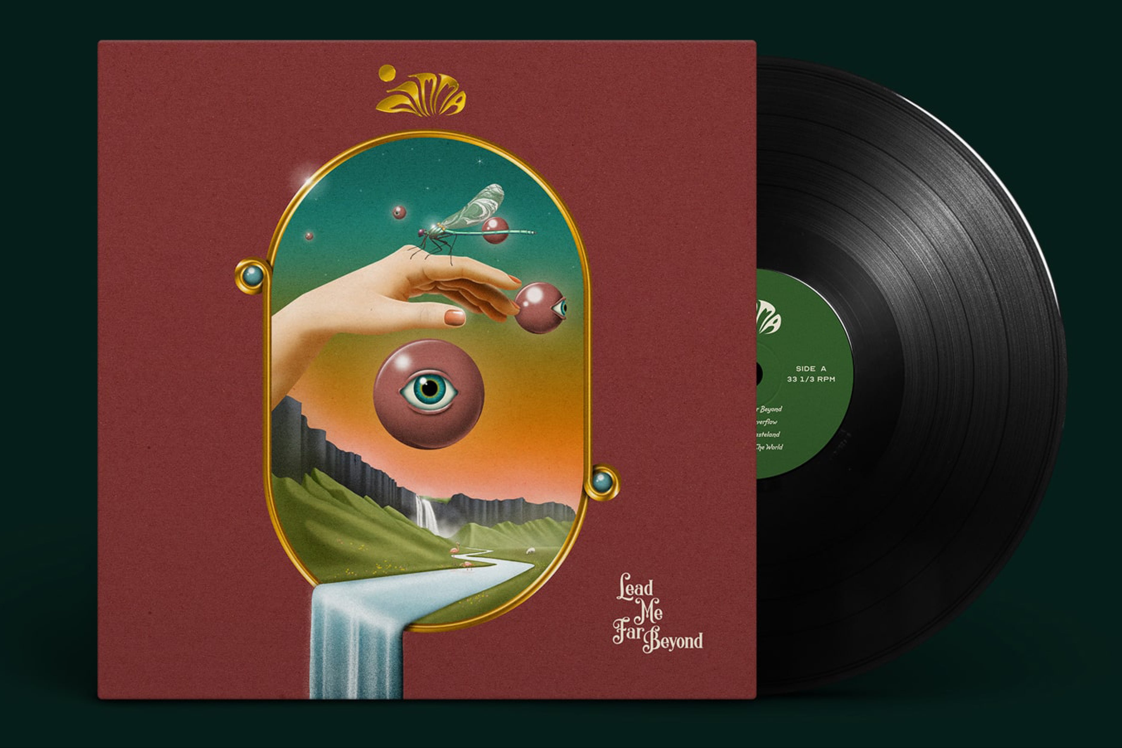
Various Album Covers
[2020–2023]